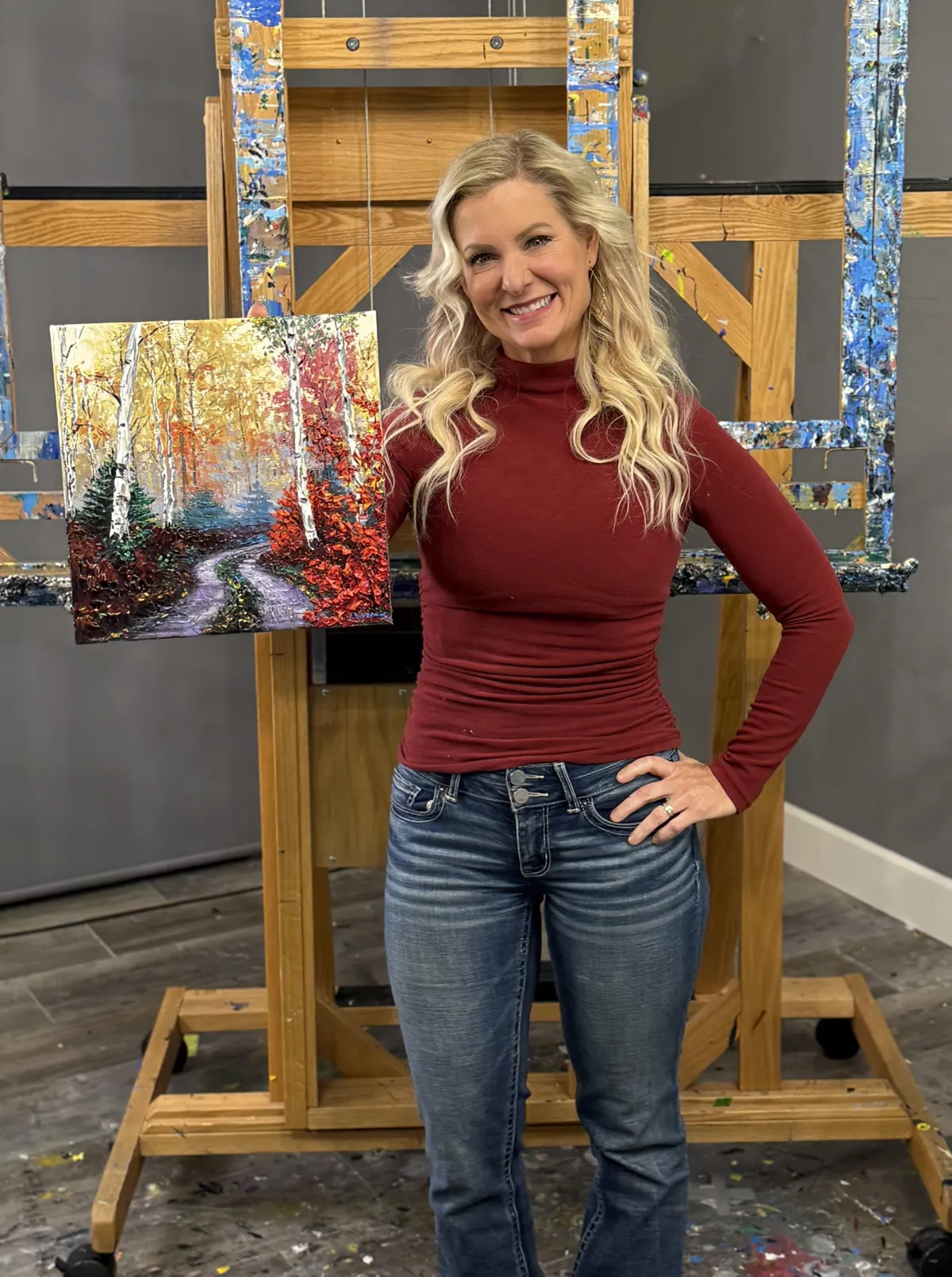
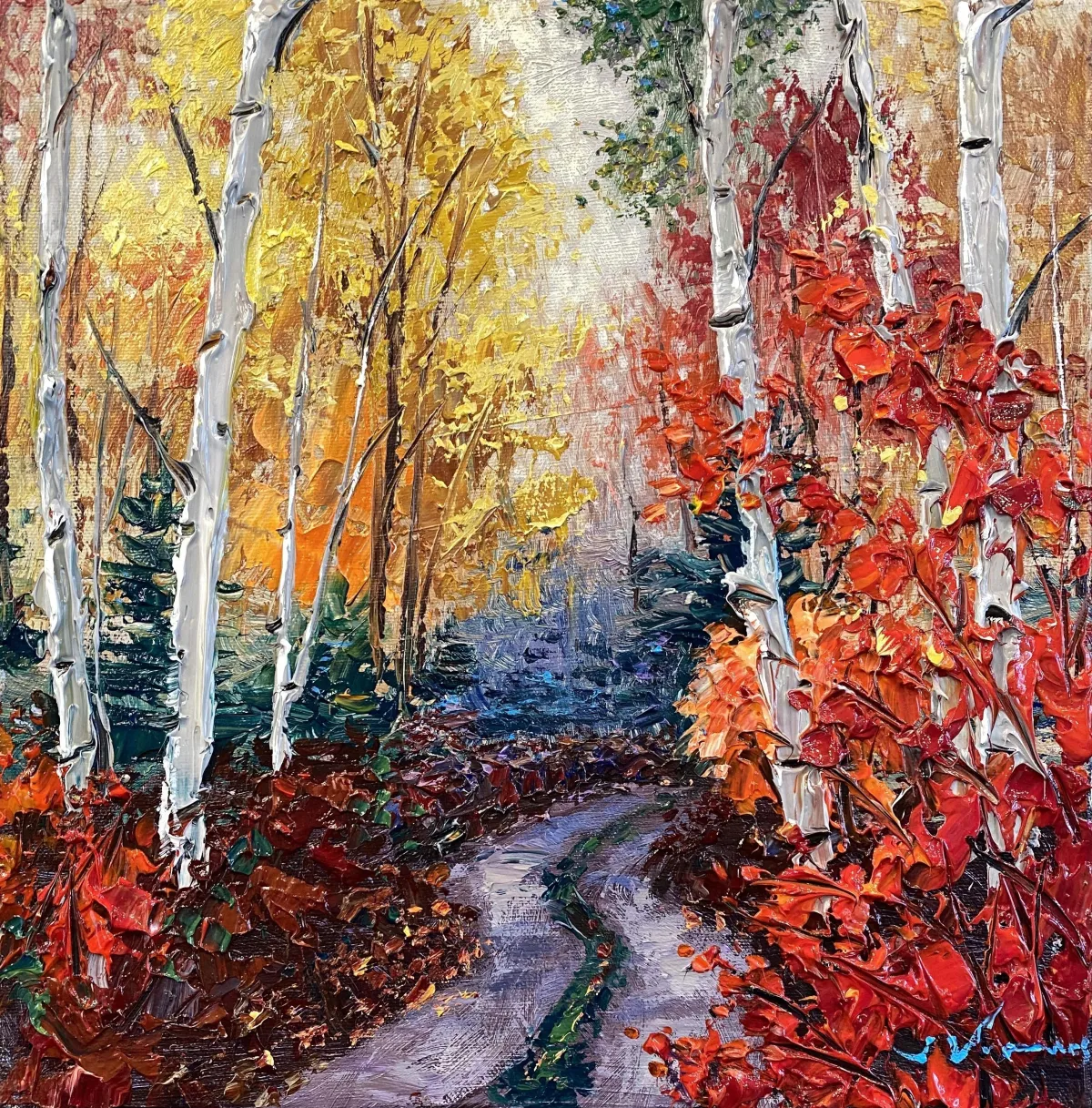
"Misty Road"
by Jennifer Vranes
Course Notes

REFERENCE PHOTO
Introduction
Welcome to the “Misty Road” tutorial – where vibrant reds, oranges, and yellows glow warmly against the crisp white trunks of birch trees. A gentle, winding path fades into the mist, adding a touch of mystery and calm, drawing you into the enchanting beauty of an autumn day.
Today, I am painting on a 12” x 12” gallery wrapped canvas. This scene will look great on any size. So, use whatever size you want.
Let’s get started.
Best practice: Read through the entire lesson before you begin.
Materials used in my Let's Dabble Painting Course:
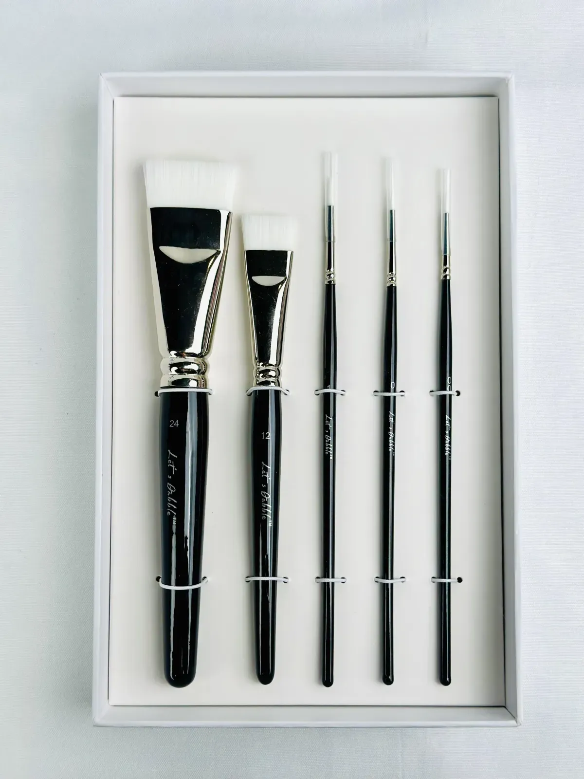
Let’s Dabble Palette Knives and Brushes

Let's Dabble Paints


Lesson 1: The Background
Sponge
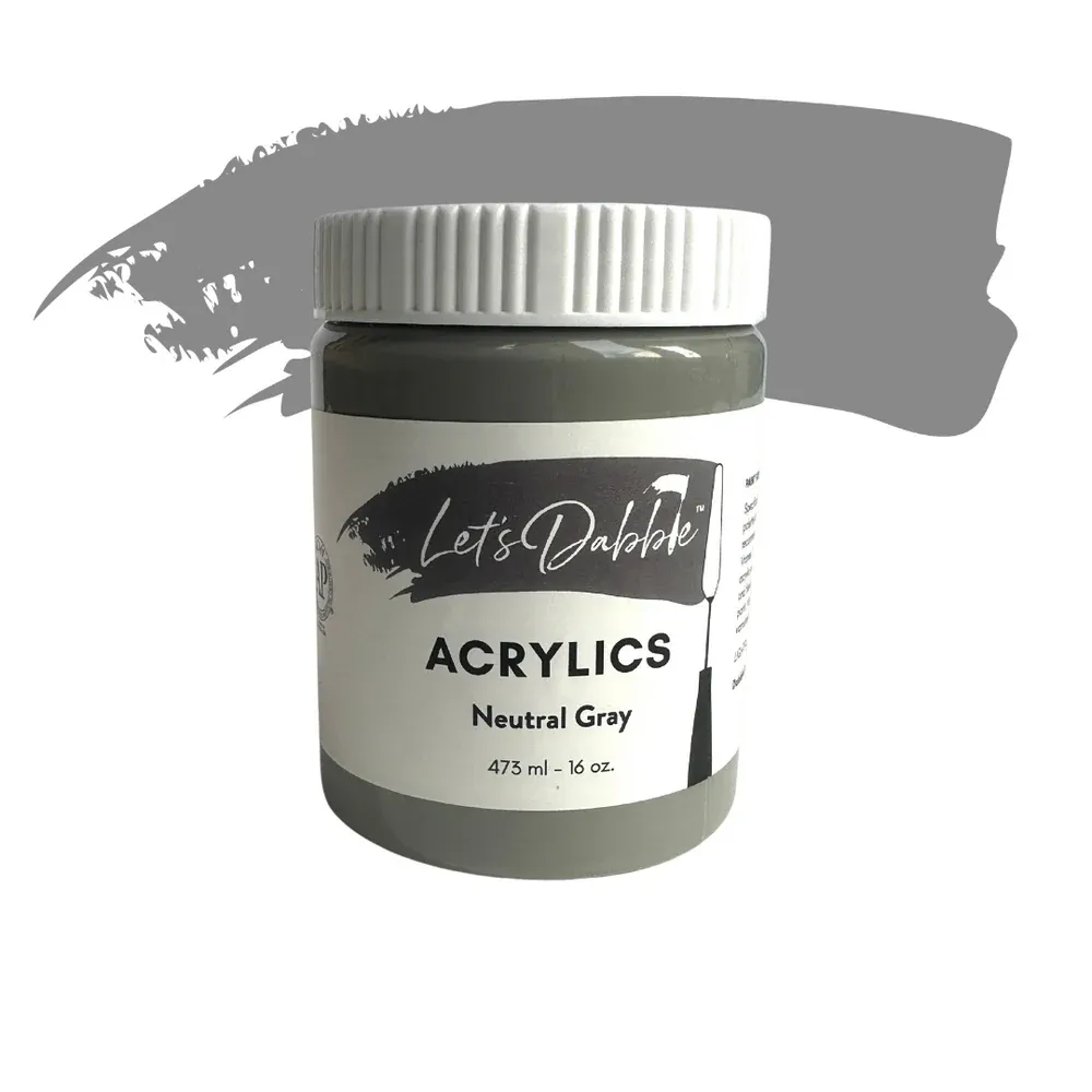
Neutral gray
Buff white
Titanium white
If your sponge is dried out, just spritz on some water until it is soft but not dripping water. Add the color above to your palette.
Sky
If your sponge is dried out, just spritz on some water until it is soft but not dripping water. Add the color above to your palette.
Foreground
As you move downward, gradually blend in neutral gray.
Cover the bottom section completely with neutral gray. Pick up and flip your canvas on the side so you can easily access the very bottom and finish off the rest of the white.
If there’s no more white showing, let it dry for a few minutes then you are ready for the next lesson.
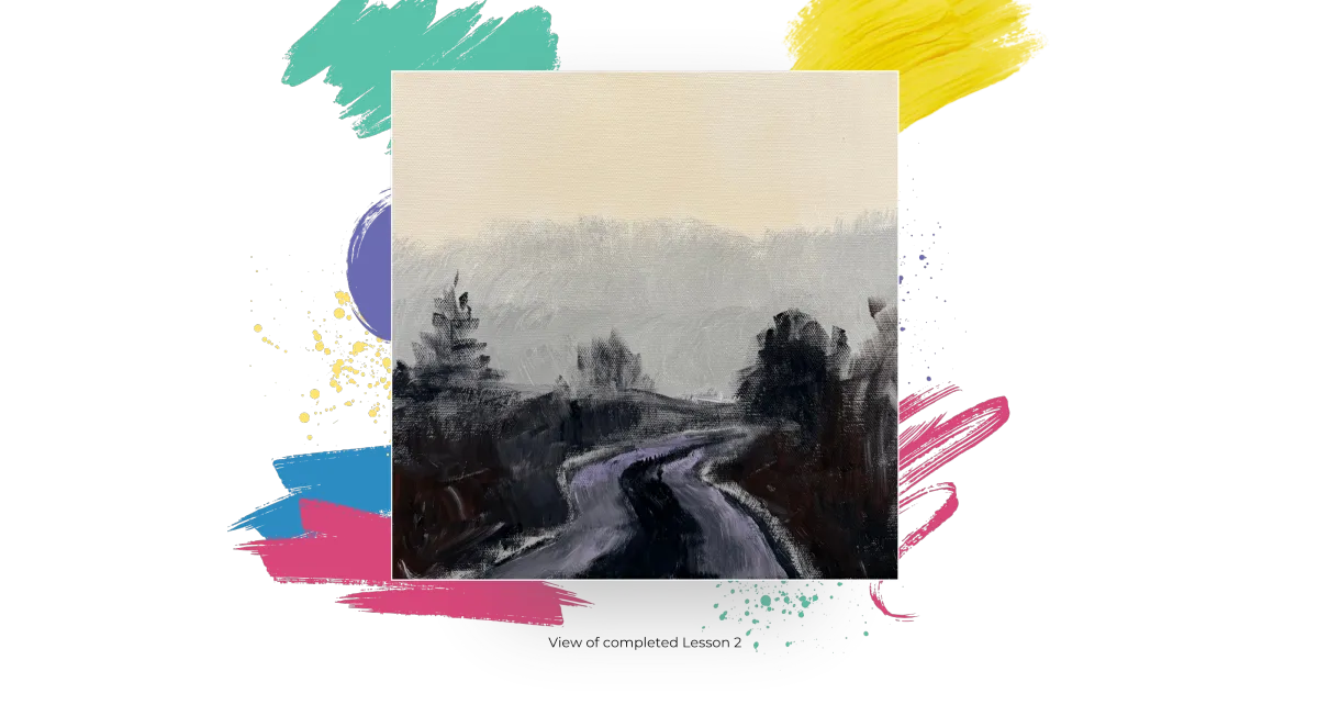
Lesson 2: Map in the Road
#24 Let’s Dabble Art brush
Burnt umber
Ivory black
Neutral gray
Brilliant purple
Start the road low on the canvas, avoiding the tendency to place it too high.
Dip your brush into a mix of burnt umber and ivory black. Keep the top of the road narrow, gradually widening it toward the bottom to create depth. Use broad, confident strokes to map the road's curves directly with your brush. Adjust the curves as needed to create natural-looking bends and angles.
Fill in the road’s center using neutral gray, leaving edges lighter for contrast. Add a touch of brilliant purple mixed with neutral gray for subtle variations in tone.
Lightly map in where the bushes and trees will be placed around the road.
If you like the shape of your little road, then you are ready for the next lesson.
Clean your brush.
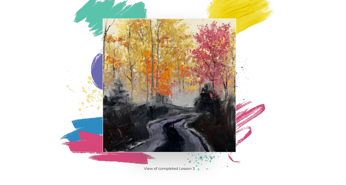
Lesson 3: The Distant Trees
#7 Let’s Dabble Art palette knife, #00 or #0 Let’s Dabble Art brushes
Previous mixture
Yellow ochre
Medium orange
Crimson
Medium red
Cadmium red light
Lemon yellow
Neutral gray
Buff white
Brilliant Purple
Crimson
Dark Purple
Gloss gel
Pro Tip: Gloss gel dries clear, so it takes on the color of your paint. It is a way to extend your paint. This is more economical than using all paint. Gloss gel also adds a bit of shine to your paint much like the look of oil paints. I mix it anywhere from about 30/50 gel/paint ratio to about 50/50.
Using your #7 palette knife, mix yellow ochre, a little lemon yellow, some gloss gel, buff white and a little neutral gray. Scoop up and scrape thin layers of this mixture across the canvas, letting the sky holes peek through naturally.
Orange and Red Tones
Using your #7 palette knife, mix yellow ochre, a little lemon yellow, some gloss gel, buff white and a little neutral gray. Scoop up and scrape thin layers of this mixture across the canvas, letting the sky holes peek through naturally.
Purple and Gray Tones
Add neutral gray with a hint of brilliant purple to create shadow areas. Layer this thinly over previous colors to add depth and contrast.
Pink-Reddish Tones
Add a small amount of crimson to your existing color mix. Add medium red, and a hint of brilliant purple. Since the color feels a bit too dark, brighten it by blending in some yellow ochre and buff white. Add in more medium red and buff white. Scoop up and scrape the paint across the canvas letting your palette knife create natural marks.
Sky Holes
Using your #7 palette knife, mix yellow ochre, a little lemon yellow, some gloss gel, buff white and a little neutral gray. Scoop up and scrape thin layers of this mixture across the canvas, letting the sky holes peek through naturally.
Extend the tree slightly higher.
Adding Highlights
Add a bit more titanium white into the mixture blend and apply light dabs along the edges.
To soften things up, blend in more of the yellow ochre mixed with buff white, especially toward the top.
Mix a new pile of lemon yellow, buff white, yellow ochre, a little titanium white and gloss gel. lightly scrape this mixture over the edges of the trees, focusing on areas where light would naturally hit, like the leaf edges.
Apply some yellow ochre, gently dragging it downward using small, light strokes with the tip of your palette knife. Add a bit more yellow ochre where needed to enhance the warmth.
Keep checking your reference photo to see where similar colors appear, using it as a guide for placement. It doesn’t need to be exact—just let it inspire you to find the right spots.
Tree Trunks and Branches
Using your skinny brush (#00 or #0) dip it into a mix of burnt umber, ivory black, and deep purple. Lightly drag the brush to create thin tree trunks and branches.
In this part, feel free to add trees and branches wherever you like—there’s no right or wrong.
When adding branches, hold your brush as lightly as possible, almost as if you’re barely gripping it. Lightly twist and flick your wrist as you drag the brush to create thin, delicate lines. Quick, fluid strokes tend to produce the most natural-looking branches. Place them wherever they feel right to you.
If you see a nice mix of colors—some soft oranges, muted reds, pinkish tones, gentle yellows, and plenty of gray blending throughout—then you’re all set for the next lesson!
Clean your palette knife and brush.
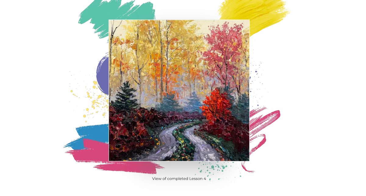
Lesson 4: The Road
#7 Let’s Dabble Art palette knife, #00 or #0 Let’s Dabble Art brushes
Neutral gray
Brilliant purple
Burnt umber
Titanium white
Ultramarine blue
Ivory black
Phthalo green
Yellow ochre
Lemon yellow
Burnt sienna
Light blue
Gloss gel
Mix neutral gray, brilliant purple, ultramarine blue, and a bit of gloss gel. Scoop up and apply this mixture starting from the back. Darken sections by adding ivory black and brilliant purple to the same mixture.
Adding Highlights to the Road
Clean your palette knife and mix a new pile of neutral gray, buff white, brilliant purple and titanium white. Lightly glaze this lighter tone over darker areas, adding a touch of ultramarine blue to enhance depth.
Green center Aisle
Mix phthalo green, yellow ochre, lemon yellow, and ultramarine blue with gloss gel. Adjust the green by adding burnt umber to prevent it from looking too minty.
Apply darker greens toward the foreground and lighter greens near the background.
Fallen Leaves
Mix burnt sienna, with the yellow ochre, crimson, and burnt umber mixture for autumn leaf tones. Speckle the road edges with these colors to mimic scattered leaves.
Bushes
For bushes, combine crimson, burnt umber, dark purple, and gloss gel. Then, layer brighter tones of cadmium red light and medium orange over darker areas for a vibrancy.
Evergreen Trees
Add evergreen trees with phthalo green, ultramarine blue, and titanium white.
Add cool tones like light blue, brilliant purple, and neutral gray to distant trees.
Revisit the road and continue working with the crimson mixture, but since it’s receding into the background, soften it slightly. Blend in a bit of light purple and neutral gray, along with a touch of gloss gel to create a smoother, more subdued effect that adds depth and blends naturally with the surrounding landscape.
Build another layer over the crimson section to add more depth and texture. Mix crimson with a bit of burnt umber, a touch of burnt sienna, and some gloss gel for a thicker, chunkier application. This will create rich, vibrant tones with a natural variation.
To add contrast, introduce slightly darker patches near the base by blending in deeper shades—think a mix of purple, crimson, and burnt umber. This will ground the colors and add dimension.
For balance, add a hint of light green. It doesn’t need to be too bright—soften it with a bit of gray to keep it muted, ensuring it blends harmoniously with the surrounding tones.
Grab some cadmium red light, a bit of medium red, burnt sienna and gloss gel. Start with the darker tones to establish depth, then gradually layer lighter shades on top for contrast.
Add some crimson and more medium red to the section on the right, focusing on keeping those vibrant reddish tones bold and rich, especially around the base of the tree.
Add the highlights with a mix of medium orange, cadmium red light and gloss gel to create a vibrant, glowing tone. Apply this mixture to the left side of your bush or tree, focusing on adding bright pops of color right over the top of the darker layers. Lightly layer it in, concentrating on the edges of your bush to create a natural, sun-kissed effect that adds depth and dimension.
Add mini tree trunks with your skinny brush using ivory black.
Add some highlight green. Mix phthalo green with a bit of yellow ochre and any remaining green tones from your palette. To brighten it up, add a touch of lemon yellow. Lightly pop this lighter green over the top, focusing on areas where light would naturally hit. This will create a fresh, vibrant contrast and bring the greenery to life.
You are ready for the next lesson. Clean your palette knife and brush.

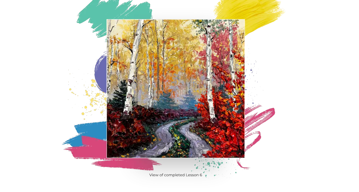
Lesson 5: The Aspens
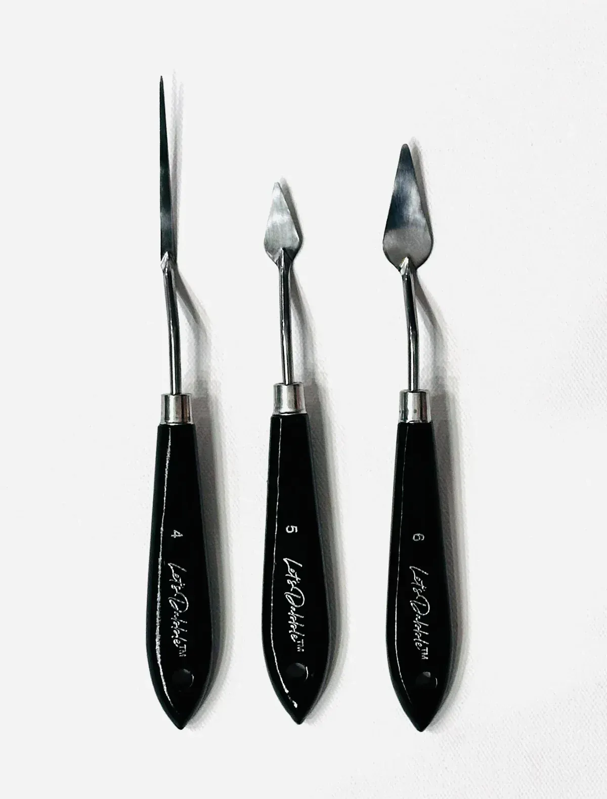
#8, #4, #5 and $6 Let’s Dabble Art palette knives
Ivory black
Modeling paste
Titanium white
Buff white
Burnt sienna
Phthalo green
Yellow ochre
Ultramarine blue
Brilliant purple
Gloss gel
Trunks
Grab your #8 palette knife, mix modeling paste, and a little bit of ivory black and stir it well. Grab a lid if you want to, and work off on it, that way when you pick up the colors, you don’t end up mixing it in with the entire batch. The lid keeps it contained.
Start sculpting in the trunks at gentle angles. Vary the thickness—wider trunks are easier for adding texture, while thinner trunks require more precision. You can use your #4 mini palette knife for the skinner ones. Let some trunks overlap with the evergreen trees for a layered effect.
Clean your palette knife.
The White Highlights
Grab your #8 palette knife again, dip it into titanium white then start on the left side of the trunks, gently press your palette knife against the canvas and drag it slightly toward the center.
The Buff Highlights
Do the same thing on the other side using the buff white.
The Knobs
You can do this with your #7 palette knife or #5 or #6 mini palette knife or a brush. Combine ivory black, burnt sienna and a little brilliant purple. Drag your palette knife or brush lightly across the surface.
Focus on making the base of the trunks slightly darker, as that’s where shadows naturally fall. As you move upward, stagger the markings to avoid uniform patterns—adding subtle variations.
For the background, use a mix of brilliant purple and neutral gray to create subtle, muted tones. This combination helps to push the background elements back, giving the painting a sense of depth. Unlike the foreground, these areas shouldn’t be too dark—keeping the tones softer ensures they don’t compete for attention.
Branches
Grab your skinny brush (#00 or #0), dip it into ivory black then lightly add some branches extending from the trunks. Keep your strokes light.
Once the branches are in place, add a touch of green at the top. This will create a nice balance, tying the greens from the lower part to the upper sections.
Carve a Heart or Initials (optional)
Choose a tree that is not right in the middle. Using your brush, spin it in the black mixture to load it up. Then, literally use it to carve a heart right into the trunk. Load it with more paint if you need to.
If you know where this is going, you can even carve their initials inside the heart. If you sell it later or give it as a gift, you could paint them in.
Grab your #6 palette knife, mix phthalo green, a little buff white, yellow ochre, ultramarine blue and gloss gel. To tone it down, add a little brilliant purple and titanium white. Apply this softened green mixture, letting some of the leaves overlap the tree trunks. Continue on the second tree, adding a bit more yellow ochre to warm up the highlights.
You’ve got your trunks sculpted in, your distant trees, the purple-ish, blackish knobs, branches are in place and the greenery patch then you are ready for the next lesson.
Clean your palette knives and brush.
Lesson 6: The Foreground Bushes
#7 Let’s Dabble Art palette knife, #00 or #0 Let’s Dabble Art brushes
Medium red
Crimson
Cadmium red light
Burnt sienna
Yellow ochre
Medium orange
Lemon yellow
Titanium white
Ivory black
Gloss gel
Darker Tones
Grab your #7 palette knife, make a new pile of crimson, medium red, and burnt sienna with gloss gel. Scoop up and apply this mixture thickly using the tip of your palette knife, clustering the leaves together. The leaves get smaller as you work your way up. Focus on keeping the bottom section darker to create depth.
Lighter Tones
Combine gloss gel with medium orange, cadmium red light, and yellow ochre. Apply these lighter tones over the dark base, concentrating on the upper sections for contrast. As you move downward, gradually transition back to medium red.
Yellow Tones
Add pops of color with yellow ochre, lemon yellow, and a bit of titanium white for brightness. Lightly sprinkle these highlights throughout the bush to add warmth and variation. Use any excess yellow to blend into nearby greenery.
Branch
Using your skinny brush (#00 or #0), dip into ivory black and weave branches through the thick layers of the bush. Reload the brush frequently, as the thick paint can make it harder to maintain clean lines.
You are ready for the final lesson.
Clean your palette knife and brush.

Lesson 7: Fine-Tune & Signature
#7 Let’s Dabble Art palette knife and #00 or #0 Let’s Dabble Art brush
Now step back, evaluate, and make tweaks if you need to. Just look for what might need to be added. Your painting will be different from mine, but hopefully, you can see the process I go through to add that something extra to make this painting all I can. Be very careful if you’re doing the wet and wet like I am, when you’re coming through, use the tip of your palette knife. Or, wait for everything to completely dry, put a fan on it in a few minutes to have it dried and then you can come in and fine tune. Let’s get started!
Fine-Tuning
Grab your skinny brush (#00 or #0), dip it into a mix of titanium white and buff white. Gently dot small, bright spots in the gaps between clusters of leaves. If any leaf clusters appear too dense or “clumpy,” sky holes help to break up the space and create a more natural, airy feel.
Mix titanium white, neutral gray and brilliant purple. Lightly dot and dab small spots between the branches and leaves like the sky holes.
If the dots appear too bright or harsh, simply smear them gently with your finger to soften it. This quick blending trick helps to keep the highlights natural and less stark, creating a smooth transition that blends seamlessly.
Bring in some medium orange, gently apply it over some of the tree trunks, allowing the color to overlap slightly with the leaves. This helps to break up the solid lines of the trunks, making them feel more natural and integrated.
Grab your #7 palette knife, add small leaves and saplings using phthalo green, lemon yellow, and buff white and gloss gel. Apply with the tip of your palette knife or make small dots to create leaf clusters. Layer some over the tree trunks.
Add just a touch more color, blending in some ultramarine blue, light blue, titanium white and neutral gray along with a hint of green to keep it balanced.
Add highlights to trees using a blend of crimson, burnt sienna, yellow ochre, and gloss gel. Lightly drag your palette knife across the textured areas.
For the road, mix brilliant purple, neutral gray, and titanium white then gently drag this mixture across the road. To darken areas, add more neutral gray with a bit of ivory black, especially toward the foreground.
Using yellow ochre, lemon yellow, and titanium white, add small dots along the road’s edges to mimic fallen leaves.
Your Signature
To make it easier to paint your signature, spritz a tiny bit of water into the paint to make it more fluid if it needs it. Twist your clean #00 brush right through light blue or whatever color you want on your palette. Then carve your name right in the wet paint in the bottom right corner. I wipe my brush with a baby wipe after each letter and then reload the brush with paint.
Name your painting with a unique name. Congratulations, you are almost done. Now it’s time to sign the back. I use a thin black permanent marker.
I put © and my name.
Then I put up my website.
Next, I put the title in all caps and in quotes.
Last, I put my full signature.