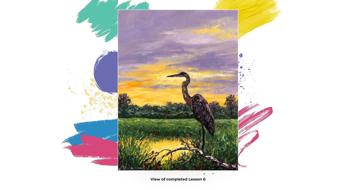
"Heron at Sunset"
by Jennifer Vranes

Course Notes
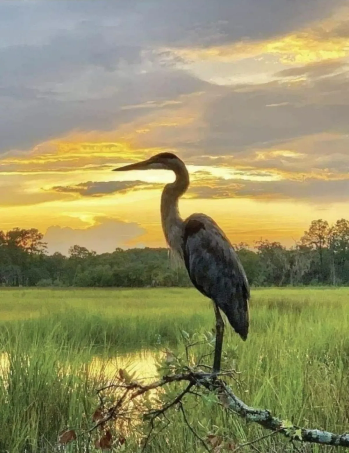
REFERENCE PHOTO
Introduction
Welcome to your new course called Heron at Sunset, and I’m so excited to guide you through every step of creating this magnificent painting. I absolutely love the color tones in this piece — beautiful complementary shades like soft purples paired with warm yellows, plus a touch of green to make it all pop.
We’ll build in a serene reflection on the water, add rich, textured grasses, and a beautifully textured branch where our elegant heron will perch. This is the very first time we’re painting a heron together in our club, and I can’t wait to share it with you!
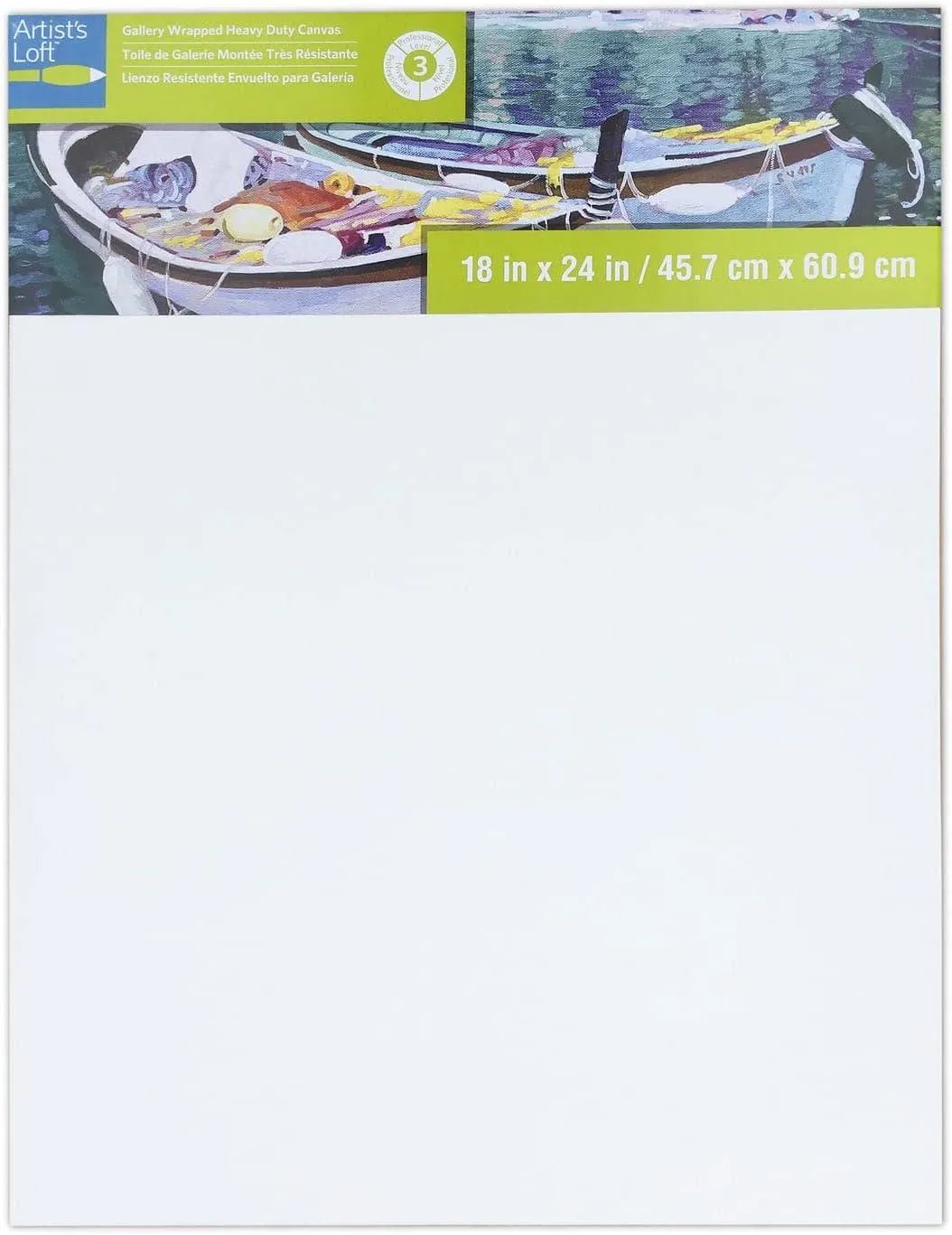
Today, I’m painting on a 12" x 16” canvas. This scene will look great on any size. So, use whatever size you want.
Let’s get started.
Best practice: Read through the entire lesson before you begin.
Materials used in my Let's Dabble Painting Course:
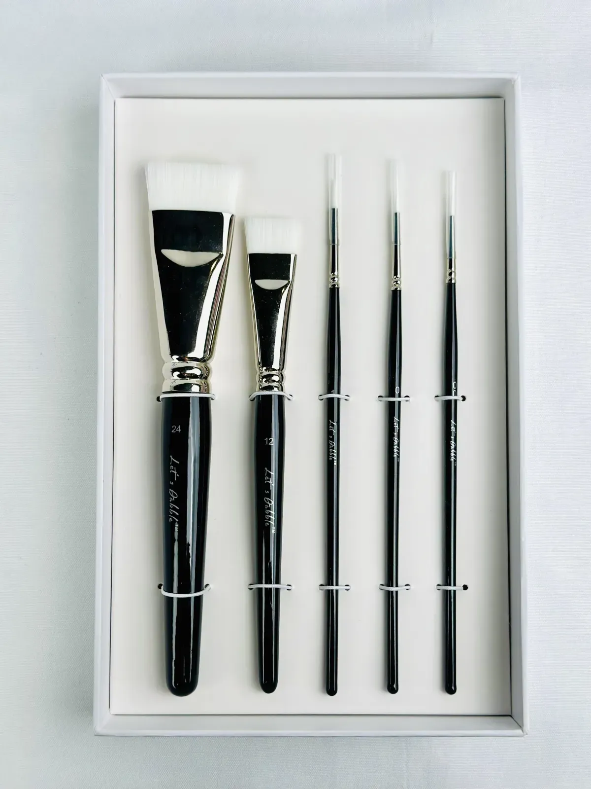
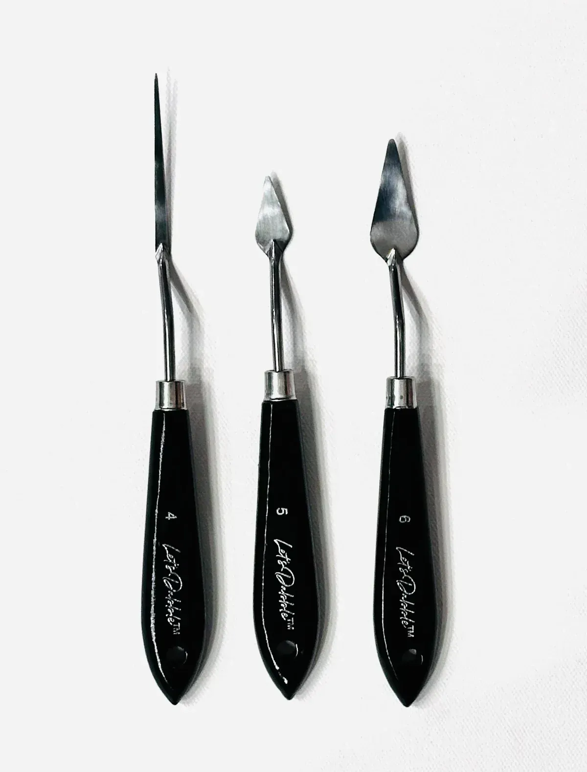
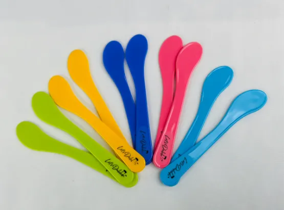
Let’s Dabble Palette Knives and Brushes

Let's Dabble Paints


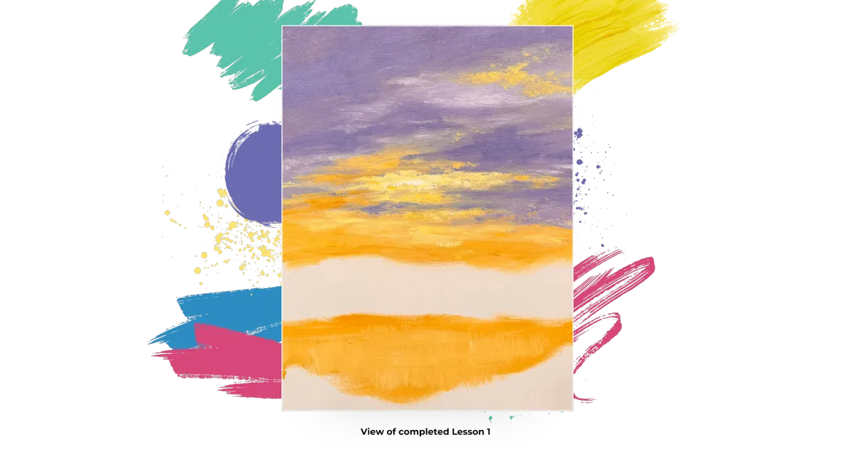
Lesson 1: The Sky
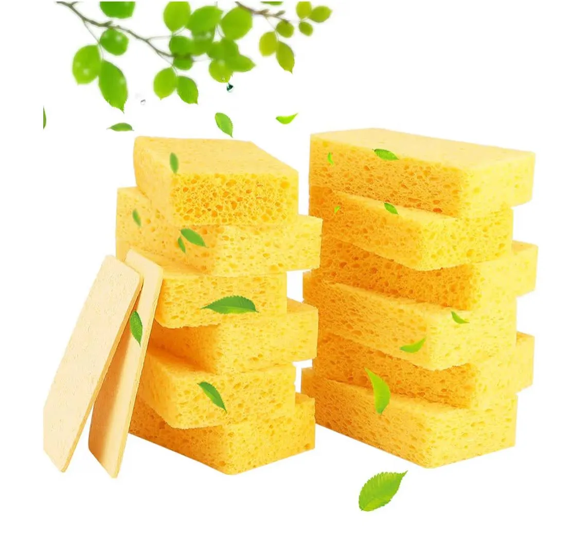
Sponge
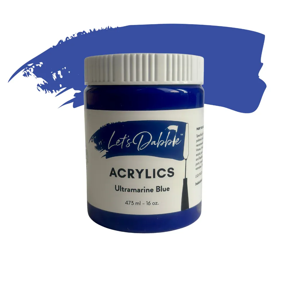
Ultramarine blue
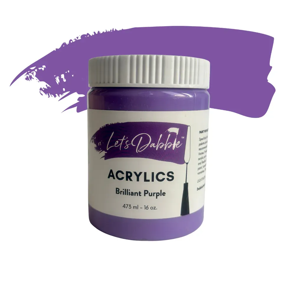
Brilliant purple
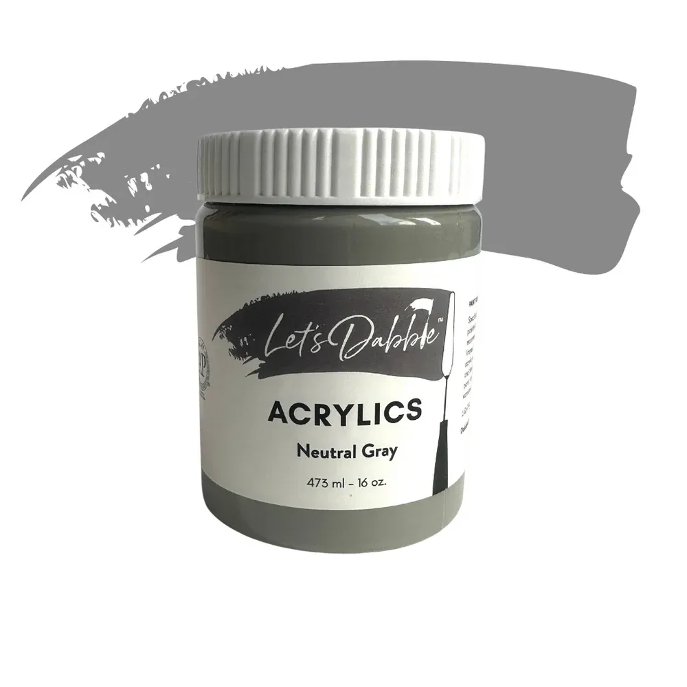
Neutral gray
Buff white
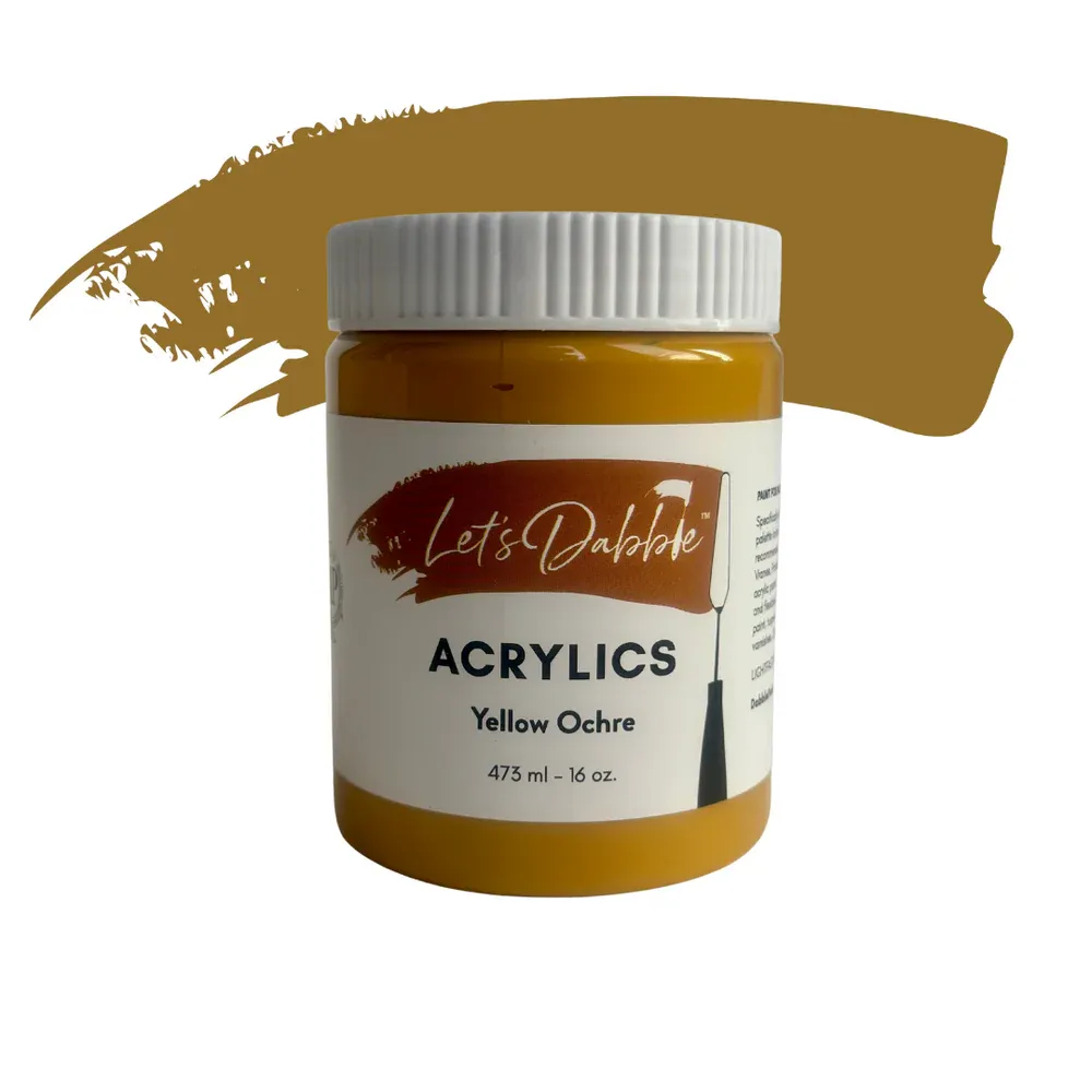
Yellow ochre
Lemon yellow
Titanium white
If your sponge has dried out, rinse it under water until it plumps up, then wring it out completely. It should be soft but not dripping. Add the colors above to your palette.
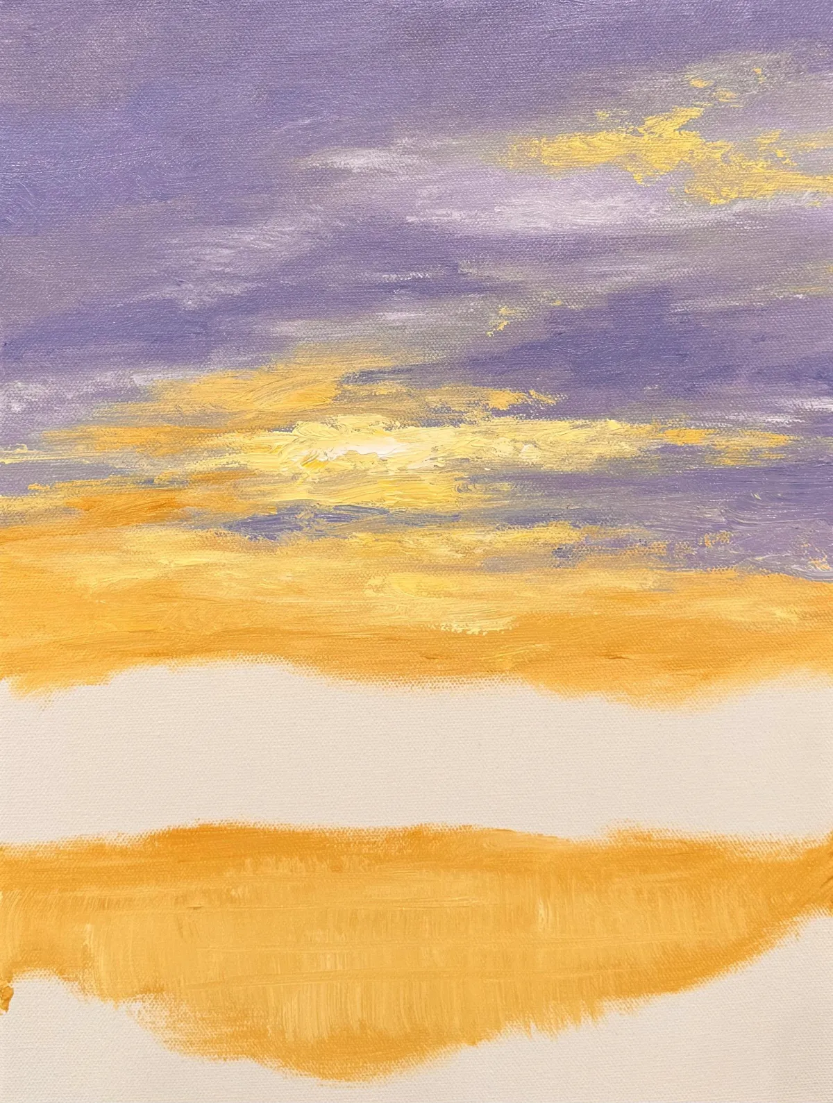
Upper Sky
Use your sponge to mix ultramarine blue, brilliant purple, and neutral gray. Starting at the very top of the canvas, sponge on this darker mix with broad, side-to-side strokes. As you move downward, gradually lighten the mixture by adding titanium white to create a gentle blend from deep purple-blue to a lighter lavender tone.
Work in layers, blending softly to avoid harsh lines. Keep your sponge moving back and forth in a horizontal direction, and remember to extend the paint over the top and side edges.
Sunset Glow (Lower Sky)
Using the other side of your sponge, combine yellow ochre, lemon yellow, and buff white. Begin applying this warm tone from just above the horizon line, working upward to merge into your purple-lavender sky. Use light, tapping motions to blend the yellow into the purple areas.
If you’d like to brighten certain highlights, add a bit more lemon yellow and titanium white to create sunlit spots. Place these toward the center of your composition where the heron’s head will eventually go, a little above the halfway mark.
Reflection in Water (Lower Third)
With the same yellow mix (yellow ochre, lemon yellow and titanium white), begin sponging the reflection area below your sunset sky. Use vertical dabs first, then soften them with a few horizontal strokes to suggest movement in the water.
If you see strong sponge edges, gently smooth them with your finger or a barely-damp corner of the sponge. Wrap this color around the lower side edges as well.
Leave space at the very bottom for foreground grasses that will be added in later lessons.
You are ready for Lesson 2.

Lesson 2: The Distant Trees
Sponge, #7 Let’s Dabble Art palette knife, Skinny brush
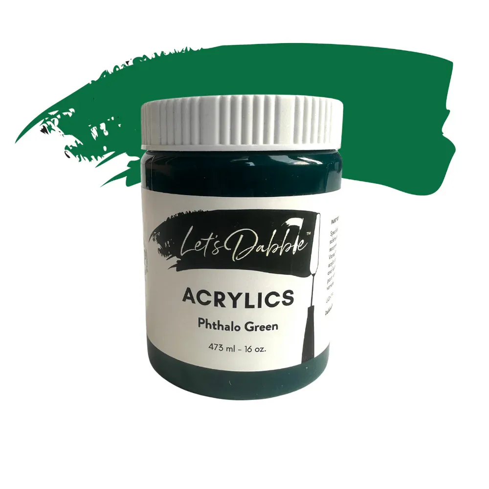
Phthalo green
Yellow ochre
Lemon yellow
Titanium white
Burnt umber
Ultramarine blue
Brilliant purple
Neutral gray
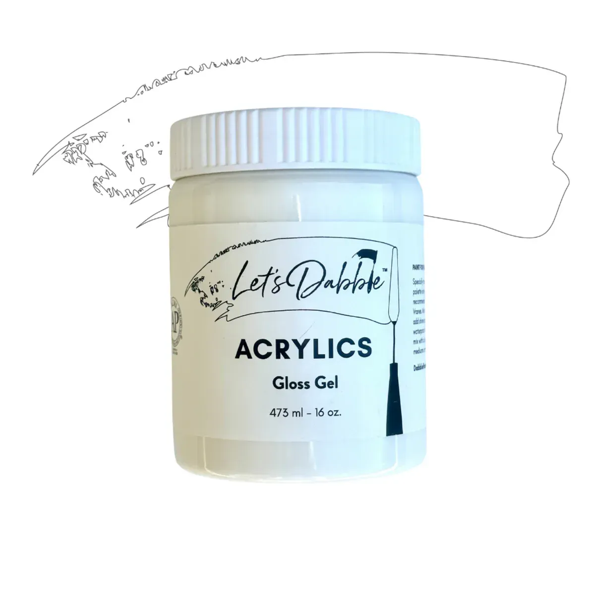
Gloss gel
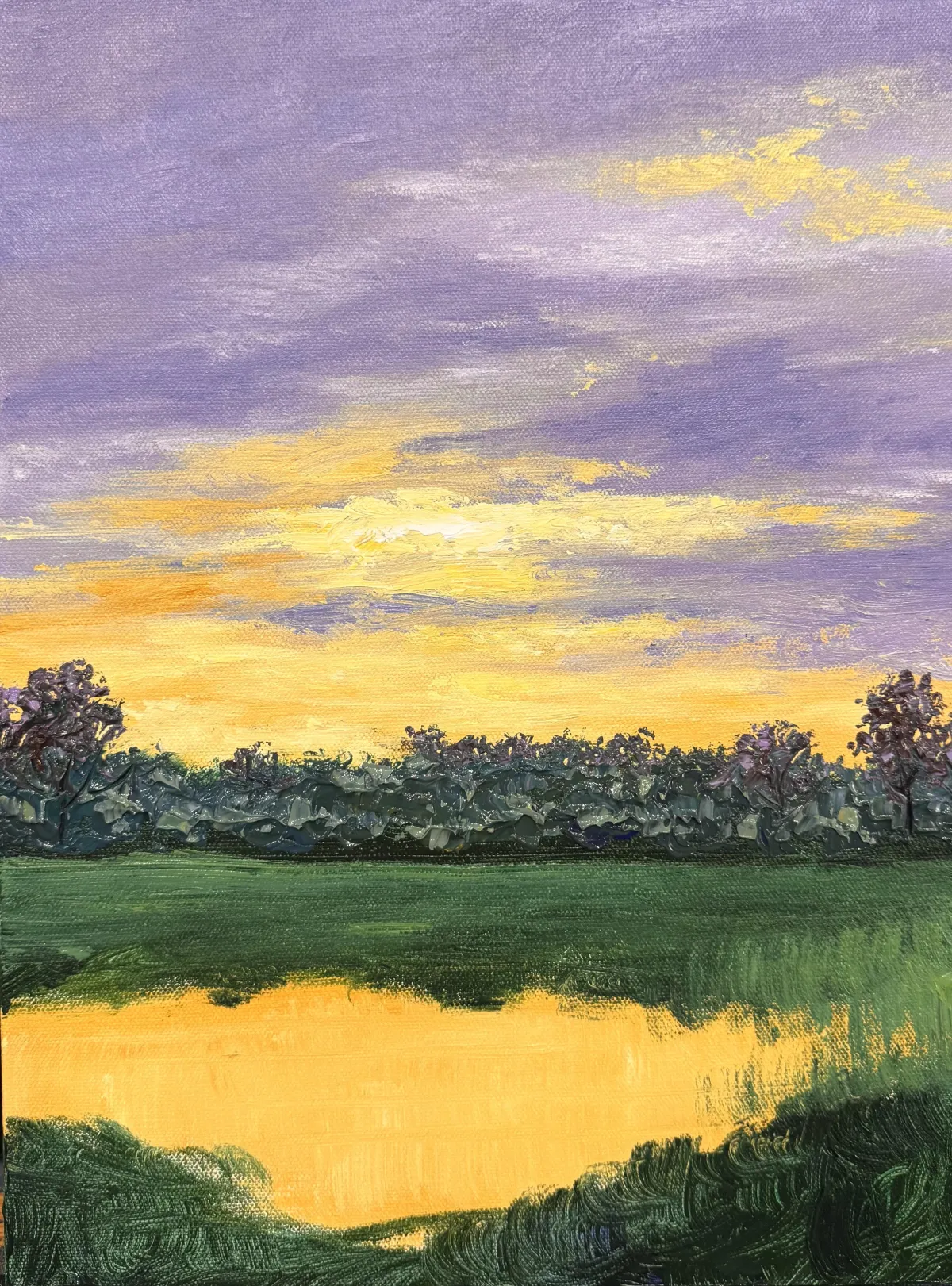
Fill in the Remaining White Canvas
Use your sponge to mix phthalo green, ultramarine blue, burnt umber, lemon yellow and yellow ochre. Cover all the remaining white canvas near the bottom, wrapping color around the edges and the base of the canvas. Don’t worry about blending perfectly—this will sit underneath the trees and grasses.
Mark the Tree Line
Use burnt umber to draw a loose horizontal guideline for the tops of your distant trees. Position this well below the center of the canvas. Softly dab the top edge of the line with your sponge to suggest a broken, natural tree top shape. Step back and adjust if needed before moving on.
Add First Tree Texture (Dark Base Layer)
Pro Tip: Gloss gel dries clear, so it takes on the color of your paint. It is a way to extend your paint. This is more economical than using all paint. Gloss gel also adds a bit of shine to your paint much like the look of oil paints. I mix it anywhere from about 30/50 gel/paint ratio to about 50/50.
Switch to your #7 palette knife. Mix brilliant purple, ultramarine blue, burnt umber, the light green mix and gloss gel. Scoop with the back edge of your palette knife and press in thick texture across your tree line. Work horizontally, letting the palette knife skip and catch. Keep it varied. This is your dark foundation layer. Add neutral gray.
Mid-Tone Layer (Add Variety)
In the same mix, add titanium white, brilliant purple and neutral gray. Apply this lighter tone across the tops and edges of your tree line, letting dark areas peek through. This creates contrast and keeps it from looking flat. Focus on uneven edges and avoid smooth shapes.
Pop-Up Trees (Add Height & Shape)
Mix burnt umber and brilliant purple. Pick a few spots to add taller trees that rise above the main line. Use your palette knife to apply them with a chunky edge, then tap in a few color shifts using green or purple. Use the tip of your palette knife to dot around the edges to break up the shape. Dots should feel clustered but not uniform—think natural tree growth.
Mix titanium white, brilliant purple, lemon yellow, yellow ochre, and ultramarine blue into your green blend, then use your palette knife to lightly dab this mixture along the tops and edges of the distant bushes, adding soft highlights for contrast while allowing darker tones to show through, and be sure to carry the color around the sides of the canvas.
Sky Holes
Use the tip of your palette knife to scratch through wet paint in small areas to reveal sky peeking through the trees. Clean the knife after each scratch to keep the edges crisp.
Add Tree Trunks
Using your skinny brush, mix burnt umber, ultramarine blue and brilliant purple. Gently drag thin trunk lines from the taller trees downward through the wet texture. Wipe your brush with a baby wipe in between strokes to keep the lines sharp.
You are ready for Lesson 3.
Clean your palette knife.
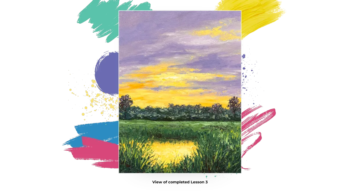
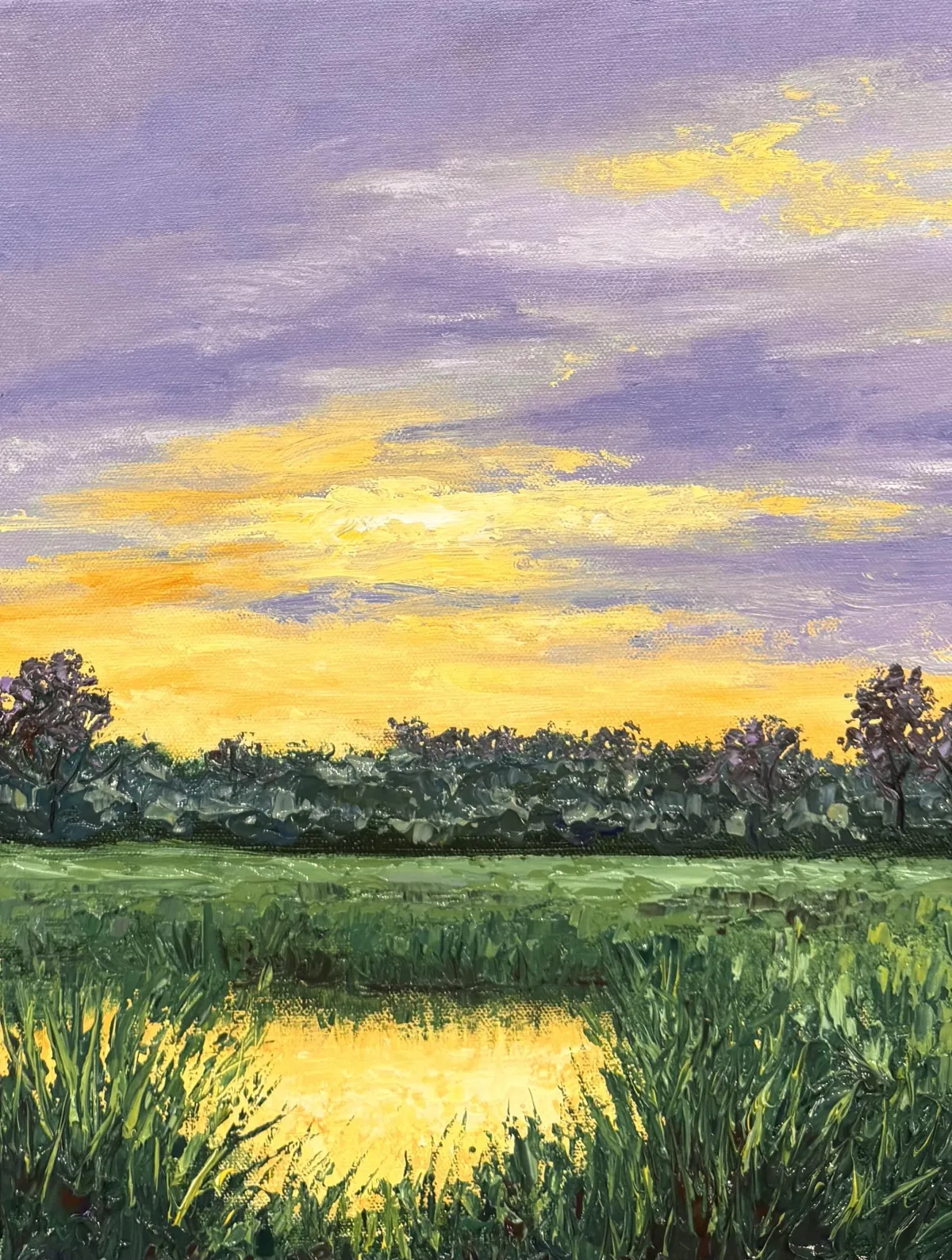
Lesson 3: Distant Grasses and The Water
#7 Let’s Dabble Art palette knife and #24 Let’s Dabble Art round brush
Lemon yellow
Yellow ochre
Buff white
Titanium white
Phthalo green
Ultramarine blue
Burnt umber
Brilliant purple
Gloss gel
Water Highlights
Grab your #7 palette knife, mix buff white and lemon yellow, then drag soft vertical strokes across the water to brighten the reflection while allowing the deeper yellow tones from Lesson 1 to peek through; darken the sides slightly by adding yellow ochre and a bit more buff white, and finish with a pop of brightness by adding extra titanium white to your lemon yellow and lightly skimming it across the center for a sunlit glow, creating three distinct water tones—darker edges, mid-yellow, and brightest center—all while keeping your strokes vertical with a few horizontal scrapes for movement.
Marsh (Base Layer)
Mix yellow ochre, lemon yellow, phthalo green, brilliant purple, titanium white, gloss gel and ultramarine blue then drag the mixture across the marshland in horizontal strokes, keeping it thick and textured, and gradually add more ultramarine blue and burnt umber as you move toward the front of the canvas to deepen the foreground, especially at the very bottom where you’ll want to see those earthy browns and darks come through, making sure to carry the color around the sides of the canvas for full coverage.
Foreground Grasses (Blade Details)
Load your small round brush (#0 or #00) with thick lemon yellow mixed into your green, then begin flicking thin grass blades upward across the water’s edge, curving some left and some right for variation, and reloading your brush frequently to keep your lines crisp, adding extra dimension by layering strokes in multiple directions and remembering to include grasses along the left and right for visual framing.
Shoreline
Using the same brush, mix burnt umber and green, then lightly mark the shoreline where the marsh meets the water to help define the edge. Pull the line lower if needed and overlap it with additional grasses as desired, knowing that everything is adjustable and nothing is permanent at this stage.
Light Grass Layers & Color Variety
Mix more lemon yellow into your existing green to create a lighter tone, then use your small brush to flick brighter grasses over the dark base using quick, twisting motions for texture, layering highlights loosely across the foreground, Switch to your #7 palette knife and finish with a final mix of titanium white, brilliant purple, and lemon yellow to add soft touches of light and color, including a few brown-green strokes to suggest cattails, all while wrapping the painting around the sides and adjusting tones as needed by layering lighter or darker greens on top.
You are ready for Lesson 4.
Clean your palette knife and brushes.
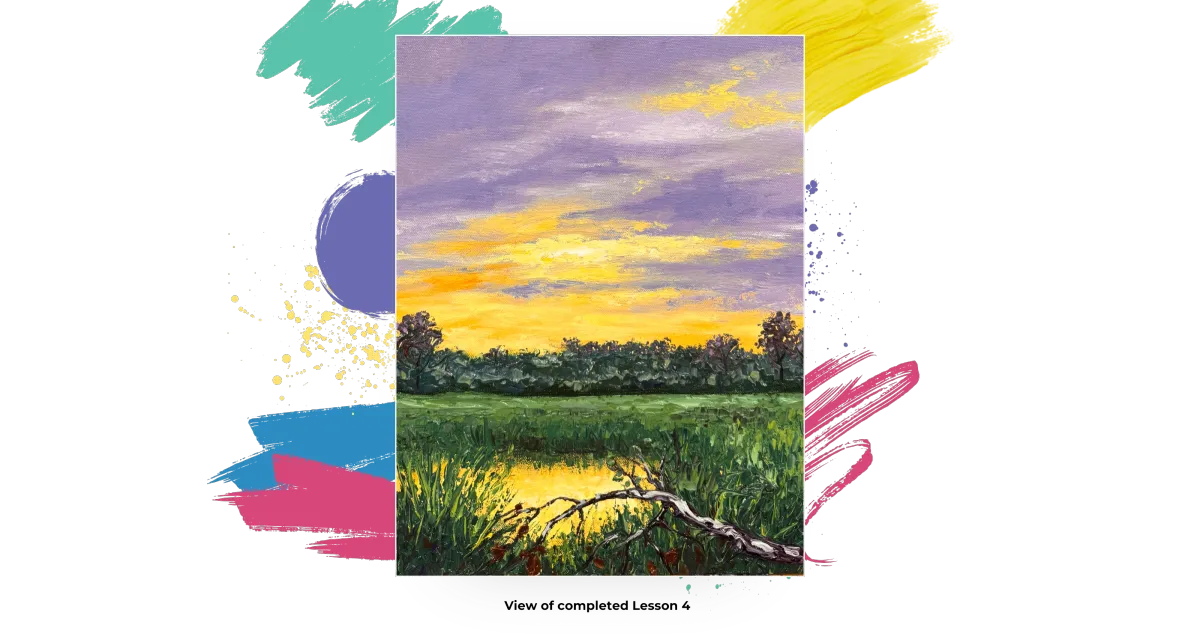
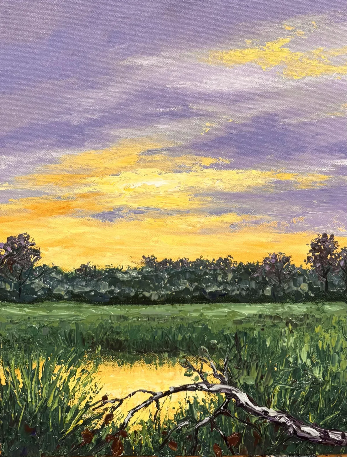
Lesson 4: The Branch
#12 and small Let’s Dabble Art brushes, #8 or #9 Let’s Dabble Art palette knife
Burnt umber
Dark purple
Ultramarine blue
Titanium white
Buff white
Neutral gray
Yellow ochre
Green Mix (from grasses)
Mapping in the Branch
Grab your #12 brush, start by mixing burnt umber with a bit of dark purple to create a darker, richer brown, then loosely sketch the shape of your branch across the lower portion of the painting, curving it above the reflection and giving it some jagged, angled movement; be sure not to end the branch in the bottom corner—bring it slightly above for better composition—and keep in mind where your heron will be perched so you can position the branch with that in mind, using a smaller brush to refine angles or add extra twigs as desired, making things slightly crooked and natural-looking, and adjusting freely since this stage is easy to change by painting over any part with your green background mix.
Building the Branch Texture
Switch to your #8 or #9 palette knife and mix together burnt umber, dark purple, neutral gray, and a bit of ultramarine blue with gloss gel to create a thick, dark base color, then scoop this up and drag it along your mapped-in branch to start building up the bark with heavy texture—this should be the thickest area of your whole painting so far, since it's sitting on top of all those layered grasses, and you can build it even more by letting it dry and returning for a second pass if you want extra 3D depth.
Texturing Thin Areas
Grab your #12 brush, start by mixing burnt umber with a bit of dark purple to create a darker, richer brown, then loosely sketch the shape of your branch across the lower portion of the painting, curving it above the reflection and giving it some jagged, angled movement; be sure not to end the branch in the bottom corner—bring it slightly above for better composition—and keep in mind where your heron will be perched so you can position the branch with that in mind, using a smaller brush to refine angles or add extra twigs as desired, making things slightly crooked and natural-looking, and adjusting freely since this stage is easy to change by painting over any part with your green background mix.
Adding the Lighter Bark Highlights
Switch to your #8 or #9 palette knife, mix titanium white, buff white, neutral gray, and a little ultramarine blue with gloss gel, then gently glide this mix across the raised bark using the side of your palette knife, sticking mostly to the top edges of the texture just like you would when painting aspen trees, and use short side-to-side movements or even your skinny brush to catch just the upper surface, adding that realistic light catching effect and giving form to the structure of the branch.
Deepening the Shadows
To add depth, mix more dark purple with ultramarine blue and press this darker shade along the underside of the branch and in the lower crevices, helping to reinforce the illusion of shadow and give the branch a stronger three-dimensional look against the background.
Leaves
Using the tip of your palette knife, scoop up small bits of burnt umber mixed with a touch of green or yellow ochre and dot in a few scattered leaves along the branch—just a few for detail—and optionally switch to a brush to apply a bit of light color to the branch tips for extra highlight, adjusting any parts you like and stepping back to see the overall shape, and if desired, feel free to scratch in tiny initials with your detail brush or knife tip while the texture is still wet, just like you might with an aspen tree carving.
You are ready for Lesson 5.
Clean your brushes and palette knife.
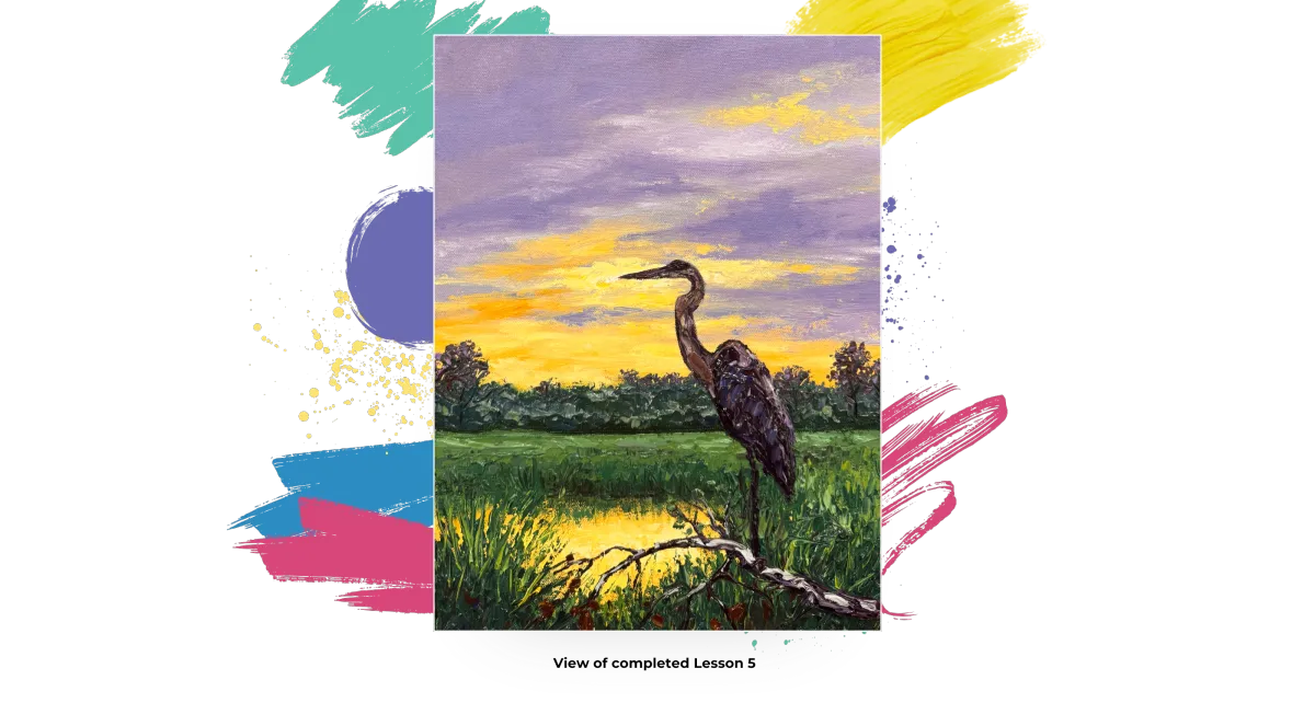
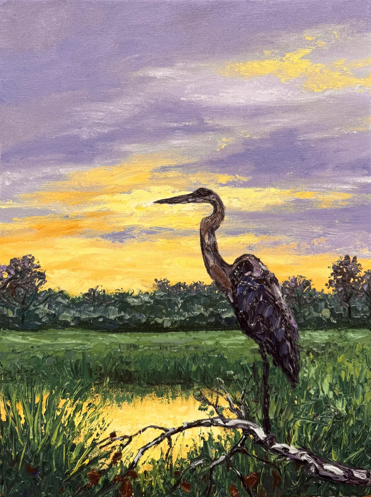
Lesson 5: The Heron
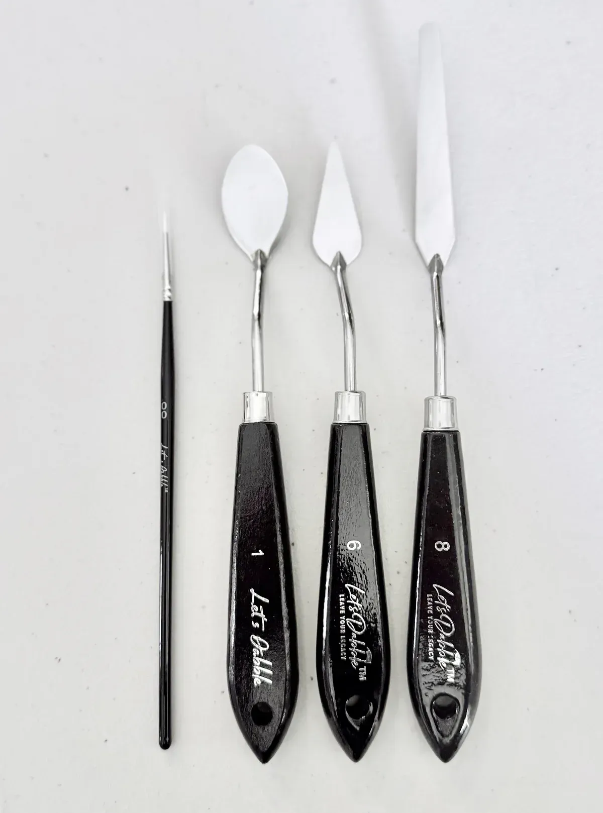
#12 Let’s Dabble Art brush, #7 and #5 Let’s Dabble Art palette knives
Burnt umber
Dark purple
Ultramarine blue
Titanium white
Buff white
Neutral gray
Yellow ochre
Gloss gel
Mapping in the Heron
Grab you #12 brush, begin by mixing burnt umber and dark purple, map in the body of the heron just to the right of the centerline of your canvas—its body should start as a rounded shape that angles downward into the legs, which are long and straight, resting somewhere on the branch you painted in Lesson 4. Use gentle strokes to sketch the general shape, not worrying about precision yet, as this is just the layout. Next, move on to mapping the heron’s neck: from the upper part of the body, guide your brush upward in a slight arc, curving sharply to create the recognizable “S” shape of a heron’s neck, finishing with a sharp beak that points almost directly to the left, and curve in a small, rounded head. If the beak becomes too long or thick, use a baby wipe to wipe it away and redraw it gently; this stage is easy to fix, and the sky is dry, making changes simple. Stand back and check proportions—adjust the neck thickness, feather shapes, and beak length as needed before moving on.
Building the Dark Texture Layers
Switch to your #7 palette knife (or #6 if you prefer) and mix a dark blend of burnt umber, dark purple, ultramarine blue, and gloss gel. Apply this dark mixture in thick, sculpted layers across the mapped-in body, neck, and head of the heron, filling in the full shape with rich texture. This initial layer should be the darkest part of the bird, creating the deep shadows that future highlights will sit on. For the neck and smaller spaces, switch to your #5 palette knife for easier precision. You can also use a touch of neutral gray and a hint of yellow ochre to add variation within the dark base while keeping the overall tone rich and deep.
Adding Feather Texture and Highlights
Switch to your #7 palette knife, with the base texture in place, begin layering lighter colors by mixing neutral gray, brilliant purple, buff white, and a touch of yellow ochre with gloss gel, and lightly drag this blend across the top side of the wing and shoulder to simulate feather highlights. Add in ultramarine blue and additional purple tones to enhance the plumage, flicking and dabbing with your knife to mimic the layered texture of feathers. Focus these lighter strokes on the upper back and wing area, keeping the darkest tones on the underside and belly. Use your #5 palette knife for final refinement, and be sure to deepen the top of the head using straight dark purple or ultramarine blue for contrast. Finally, check the neck curve, wing shape, and face area for any shape corrections—if needed, gently shave off parts with your palette knife or brush and touch up with background paint.
You are ready for the final lesson. Clean your brush and palette knives.
Lesson 6: Fine-Tune Signature
Baby wipe, #00 Let’s Dabble Art brush and #5 Let’s Dabble Art mini palette knife
Previous colors and mixture
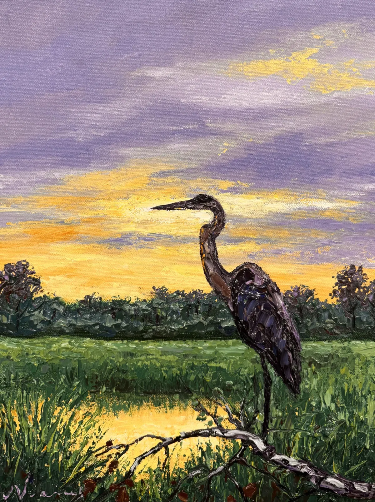
Now step back, evaluate, and make tweaks if you need to. Just look for what might need to be added. Your painting will be different from mine, but hopefully, you can see the process I go through to add that something extra to make this painting all I can. Be very careful if you’re doing the wet and wet like I am, when you’re coming through, use the tip of your palette knife. Or, wait for everything to completely dry, put a fan on it in a few minutes to have it dried, and then you can come in and fine-tune. Let’s get started!
Fine-Tuning
Using your finger, mix titanium white with lemon yellow. Tap this glowing blend into the brightest spot of the sunset—right where the light curves around the heron’s neck. Use a baby wipe to gently blur the edges for a soft, luminous glow.
With a baby wipe, smudge a light mix of yellow ochre into the edge between the purple and yellow sky to break up any harsh horizontal lines. Let it blend softly into the background for a more painterly sky.
Use your #00 brush to lightly redefine the heron’s legs with a mix of dark purple and ultramarine blue. Then mix green, lemon yellow, and titanium white and use your #5 palette knife to scrape this lighter green around the heron’s legs. This contrast helps the legs stand out and lets you clean up any overly thick areas.
Brighten the tips of the foreground grass by mixing your existing green blend with lemon yellow and titanium white. Use your palette knife to lightly skim this mixture across the raised grass texture. Let the lighter tones sit only on the surface, so the dark green beneath still shows through.
Dip your #00 brush into a mix of burnt umber and dark purple, then add tiny twigs and a few scattered leaves along the heron’s perch. Add variation with a touch of green and buff white in a few of the leaf strokes.
Mix buff white, yellow ochre, and titanium white for a “water hole” blend. Use your detail brush to dot slender streaks of this mixture into the pond where grasses part, especially near the base of the heron. This simulates light reflecting through the reeds.
Use your #00 brush to paint slender branches or additional detail lines, if desired, across the heron’s perch. If any area feels too busy or chaotic, gently shave or paint over it with your foreground color mix to clean up the shape.
Your Signature
To make it easier to paint your signature, spritz a tiny bit of water into the paint to make it more fluid if it needs it. Twist your clean #00 brush right through brilliant purple with titanium white or whatever color you want on your palette. Then carve your name right in the wet paint in the bottom right corner. I wipe my brush with a baby wipe after each letter and then reload the brush with paint.
Name your painting with a unique name. Congratulations, you are almost done. Now it’s time to sign the back. I use a thin black permanent marker.
I put © and my name.
Then I put up my website.
Next, I put the title in all caps and in quotes.
Last, I put my full signature.