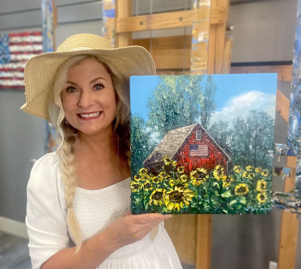
"American Dream"
by Jennifer Vranes
Course Notes
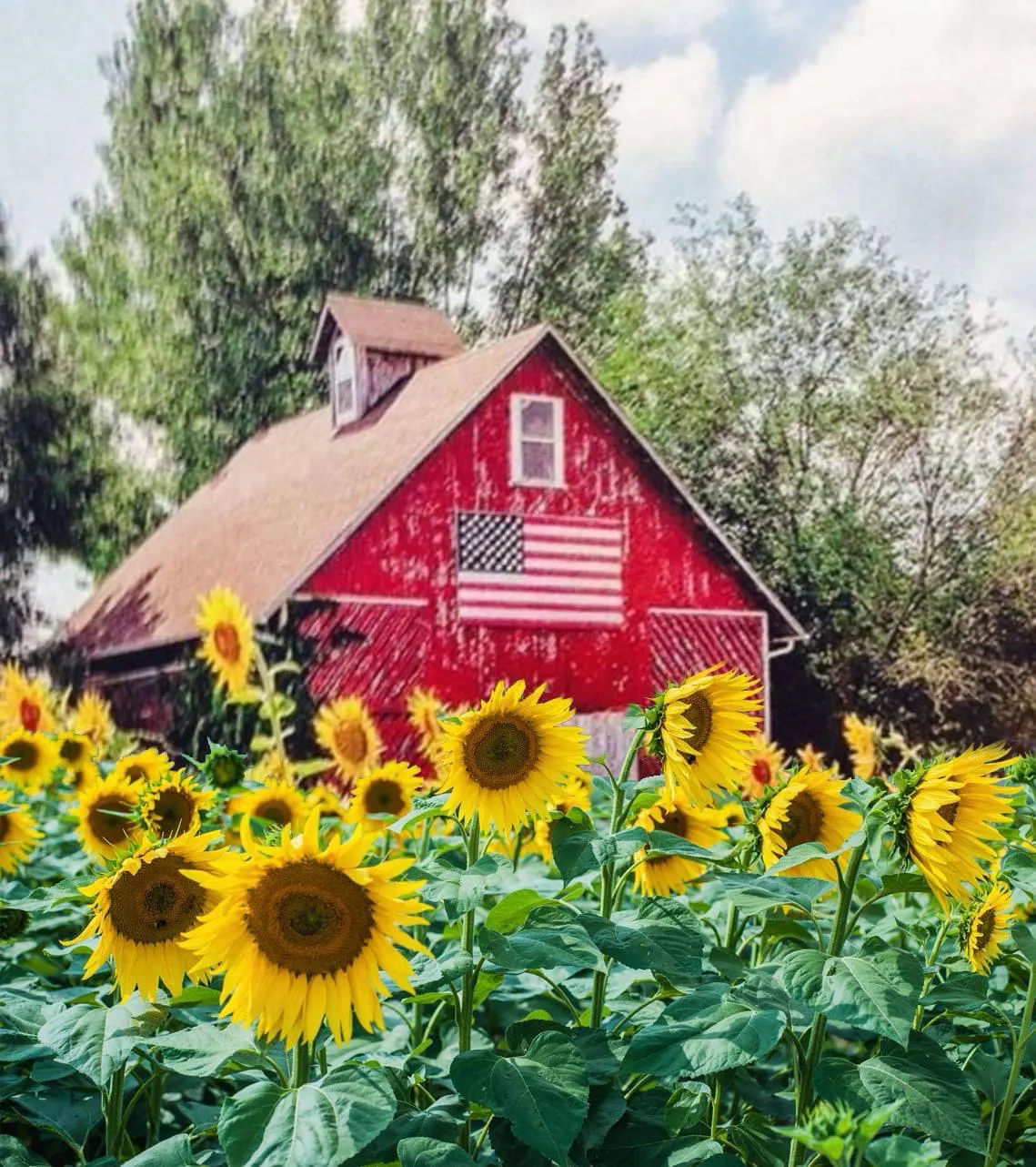
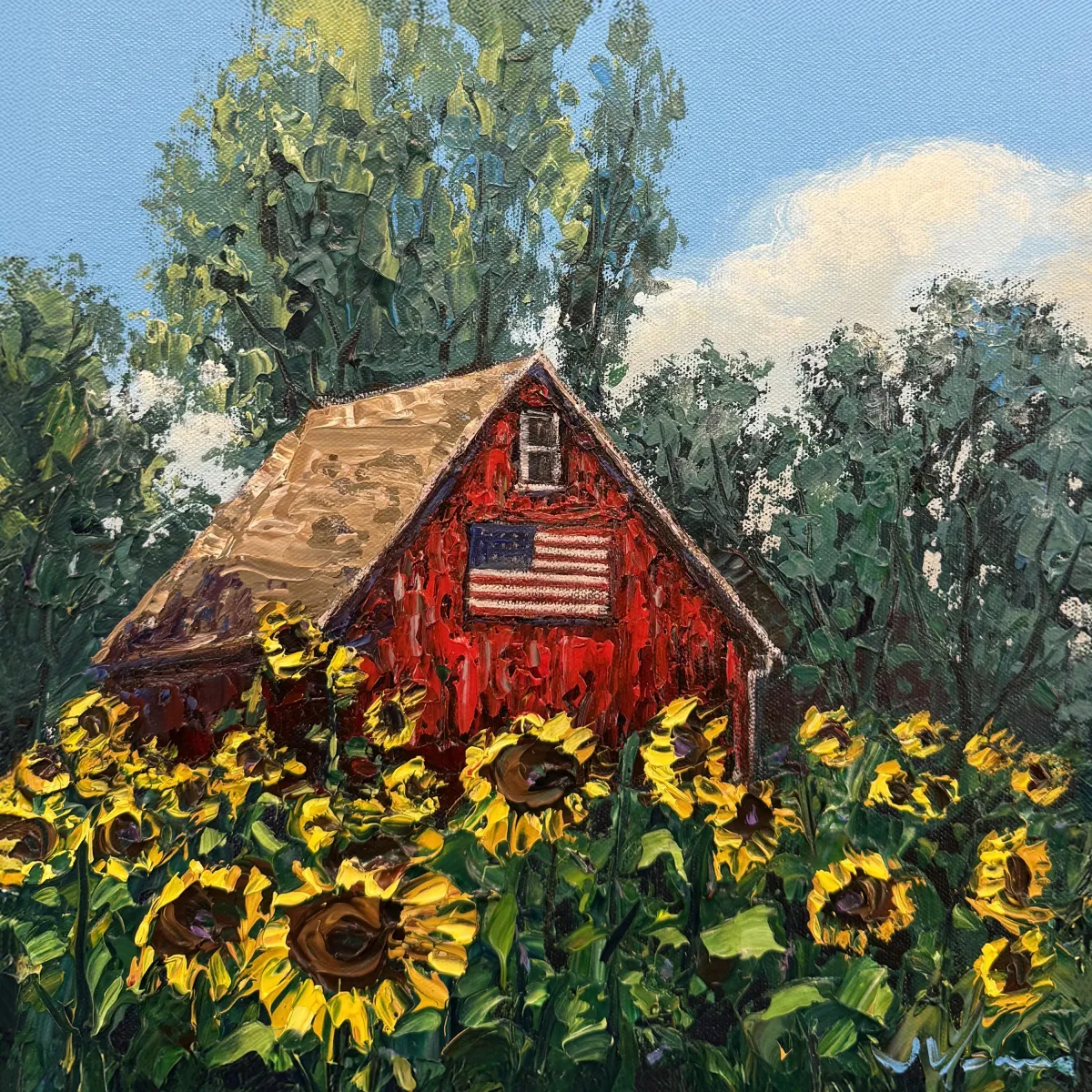
REFERENCE PHOTO
Introduction
Welcome to your brand new course—American Dream! We’ll paint a classic red barn surrounded by golden sunflowers, all basking under a bright blue sky. And with the American flag proudly displayed on the barn front, this scene radiates warmth, nostalgia, and heart.
Maybe this barn is tucked away in the Midwest, nestled in a quiet Oregon valley, or somewhere imagined from a childhood memory. That’s the magic of painting—you get to make it your own.
There’s so much to love here: thick impasto sunflowers, rich barn textures, swaying green trees, and the subtle sparkle of light glancing off the leaves and petals. This piece is packed with joyful energy and patriotic spirit—but don’t worry, we’ll break it down step by step so it’s fun and approachable from start to finish. You’ll walk away with a painting that’s not only beautiful, but deeply meaningful too.Today, I’m painting on a 12” x 12” canvas. This scene will look great on any size. So, use whatever size you want.
Let’s get started.
Best practice: Read through the entire lesson before you begin.
Materials used in my Let's Dabble Painting Course:
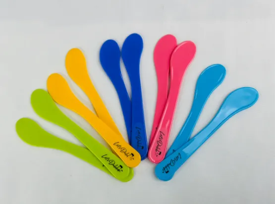
Let’s Dabble Palette Knives and Brushes

Let's Dabble Paints

Lesson 1: The Background
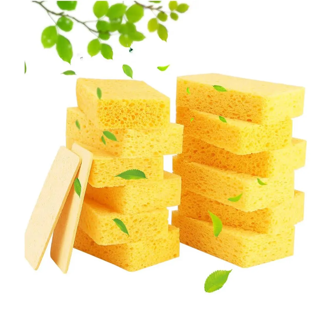
Sponge
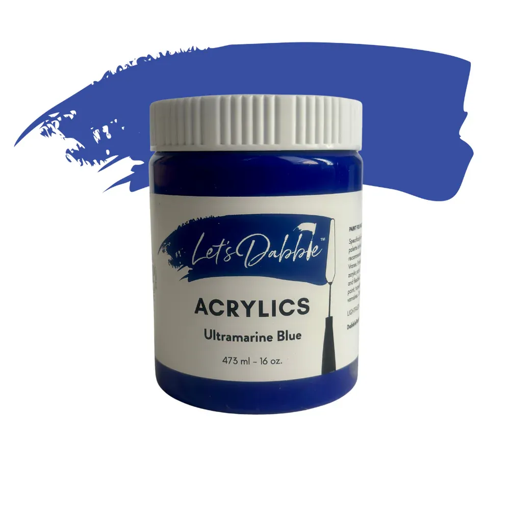
Ultramarine blue
Light blue
Titanium white
Neutral gray
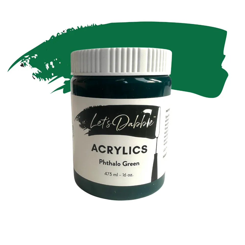
Phthalo green
Burnt umber
Dark purple (Red violet deep)
If your sponge is all dried out, just spritz on some water until it is soft but not dripping water. Add the colors above to your palette.
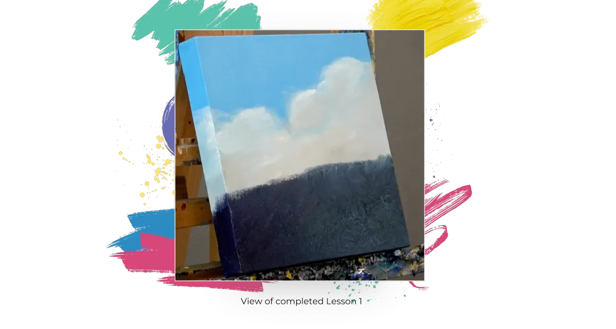
Sky
Using your sponge, mix titanium white, light blue, and ultramarine blue until you get the sky color you prefer. Apply the color with your sponge using circular motions to get the paint down into the tooth of the canvas. Go down a bit past the halfway mark of the canvas. Don’t forget to go over the top and the sides of the canvas, too. And don’t forget the corner folds! Usually, just one coat will be all you will need.
Clouds
With a little neutral gray and titanium white, start at the bottom of the blue sky and work up to map in some clouds. Don’t forget to take the clouds around the side, too. Once the gray is mapped in, add some white highlights on top. You can use a baby wipe to blend the edges. Bring the clouds down to just below the midline.
Foreground
Flip your sponge to the other side. Continue down the canvas. Start a little above the cloud line and use phthalo green, burnt umber, and dark purple (red violet deep) all the way to the bottom. Just fill in anywhere you have white canvas. Make sure you do the sides and the bottom edge of the canvas, too.
Lesson 2: Mapping in the Barn
#24 Let’s Dabble Art brush
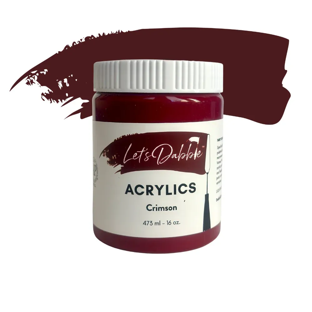
Crimson
Ivory black
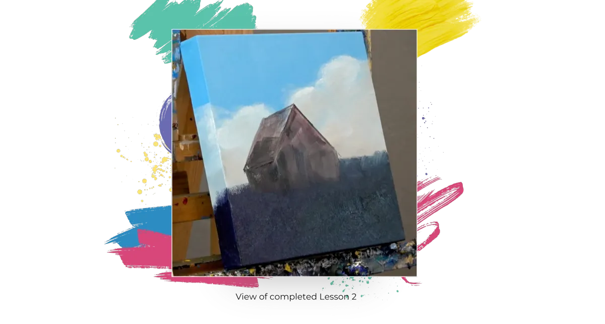
Grab your #24 brush—this one has shorter bristles for better control, making it perfect for mapping shapes. Mix crimson and ivory black. Use this mixture to roughly sketch the shape of the barn directly onto your canvas.
Don’t worry about details—this is just a loose block-in to help determine placement. You’re not painting the barn yet—just marking where it will go so you know how to position your surrounding elements, like trees and sunflowers.
Start with a simple triangle for the roof, then connect it with basic rectangles for the body of the barn. Keep the shapes straightforward—this is meant to be quick and loose.
Adjust the size as needed. If it feels too small after sketching it in, you can always make it a little larger. The block-in stage is flexible—you're just figuring out the general proportions and placement.Position the barn slightly off-center (a bit to the left) to create a more dynamic composition.
Clean your brush.
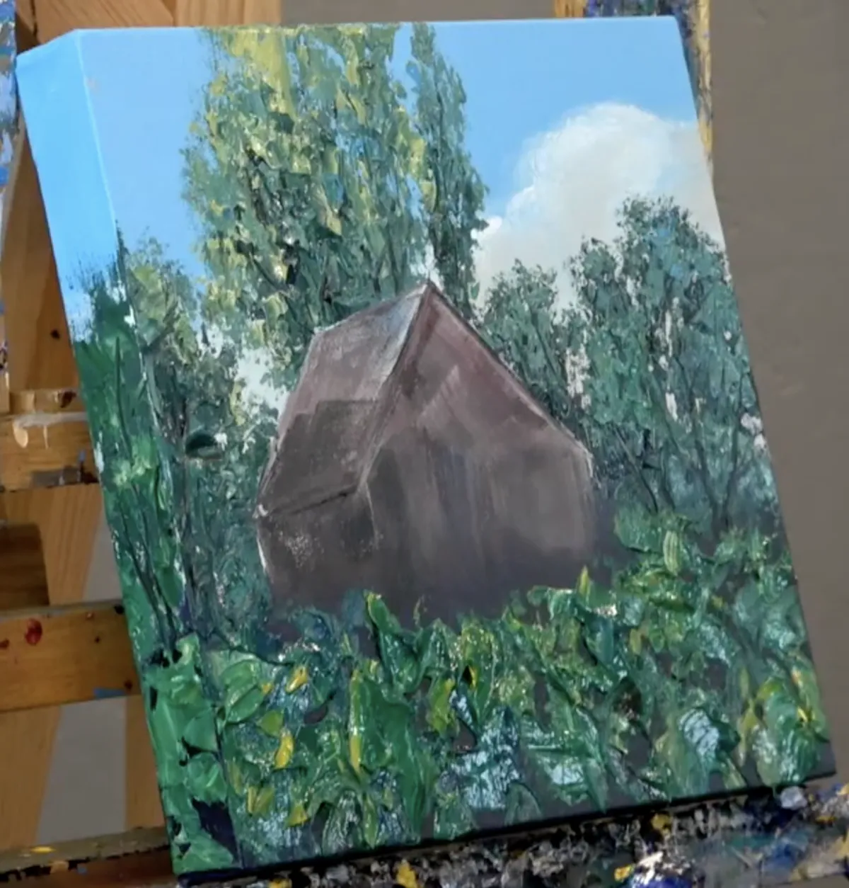
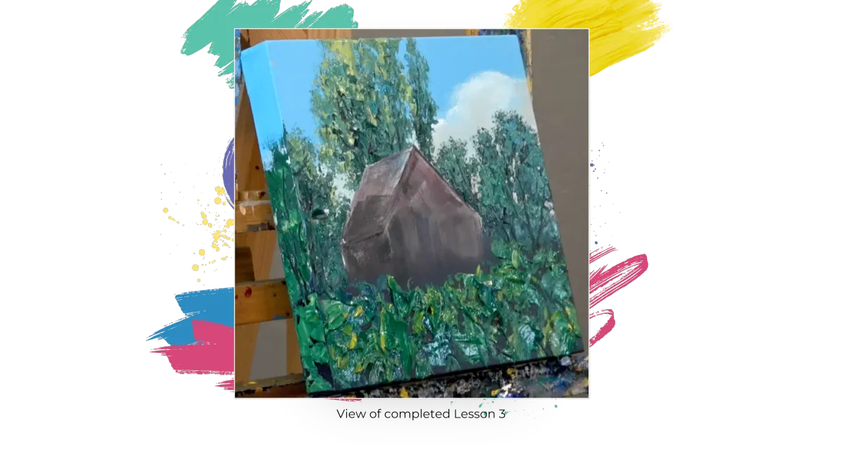
Lesson 3: Background Trees
#7 Let’s Dabble Art palette knife and #1 Let’s Dabble Art brush
Phthalo green
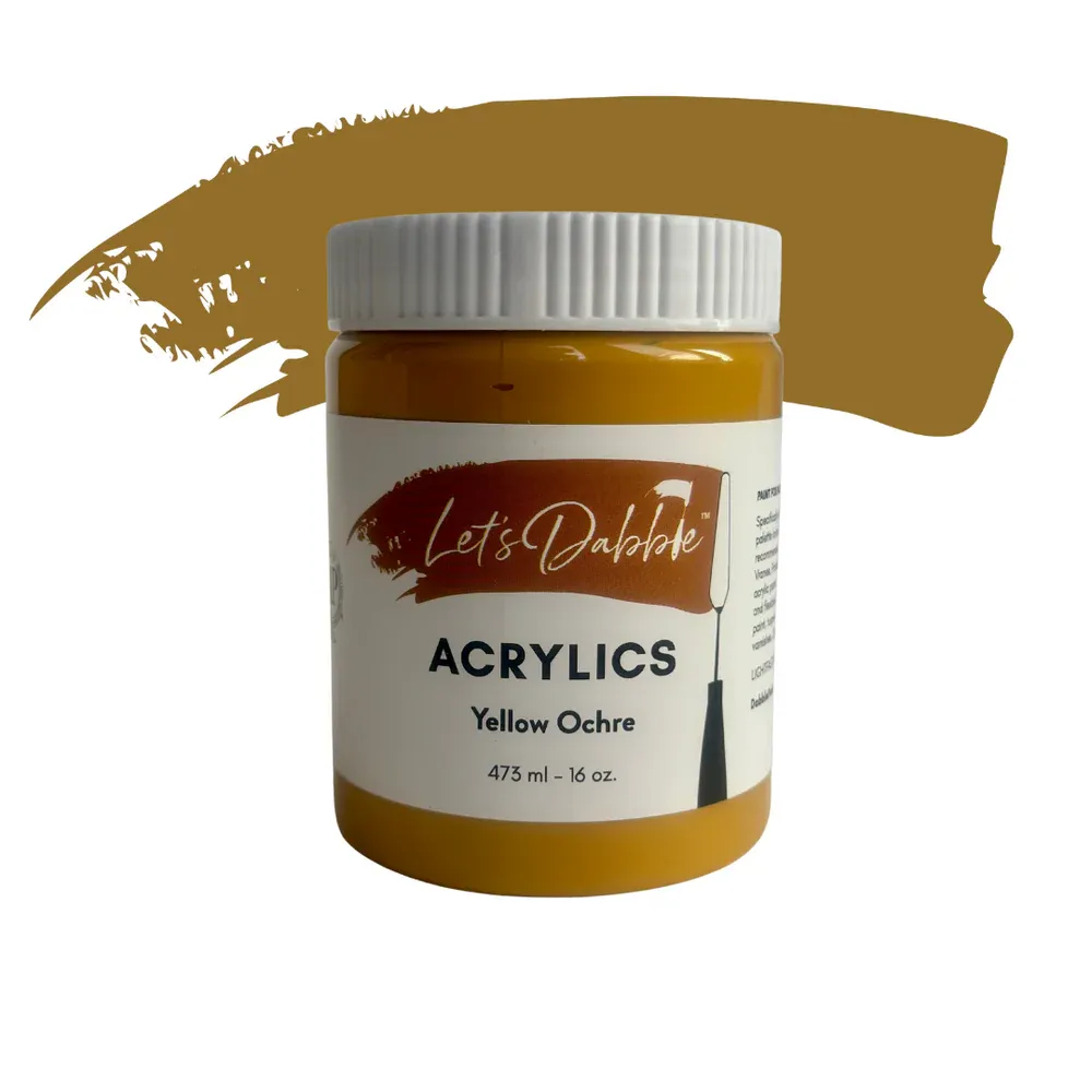
Yellow ochre
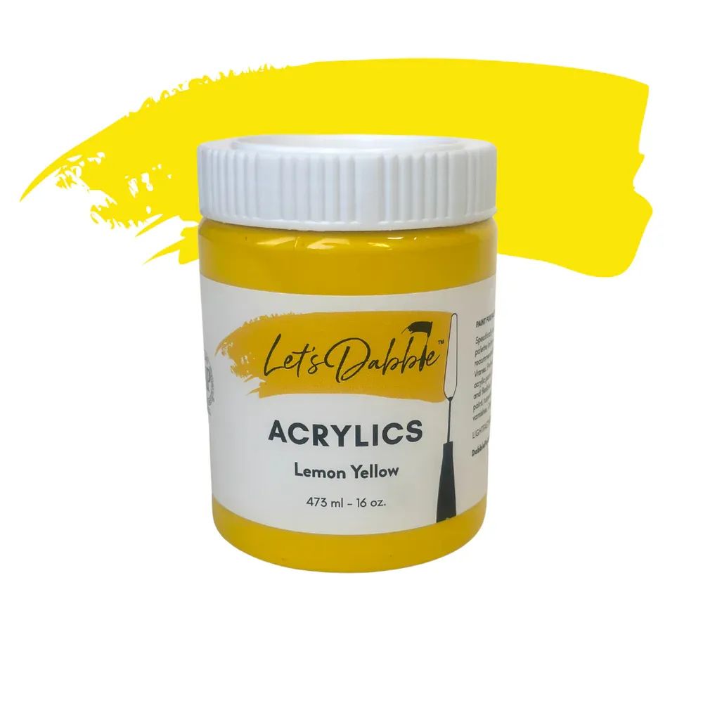
Lemon yellow
Ultramarine blue
Light blue
Titanium white
Ivory black
Burnt umber
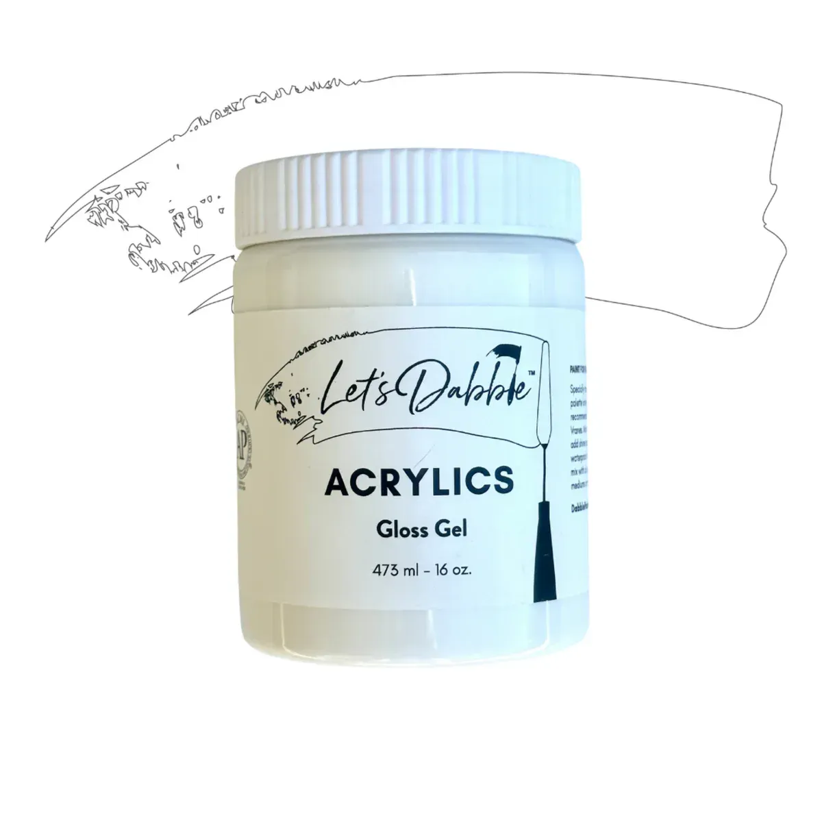
Gloss gel
Pro Tip: Gloss gel dries clear, so it takes on the color of your paint. It is a way to extend your paint. This is more economical than using all paint. Gloss gel also adds a bit of shine to your paint much like the look of oil paints. I mix it anywhere from about 30/50 gel/paint ratio to about 50/50.
Map in the Mountain
Grab your #24 brush, start with a mix of ultramarine blue and brilliant purple then map out the general shape of your mountain range across the mid-upper section of the canvas. Fill in this shape with your purple-blue mixture. Let the shape flow naturally and avoid symmetrical camel humps. Keep the peak off-center, either to the left or right of your canvas centerline for better composition.
Background Trees
Grab your #7 palette knife, mix together phthalo green, yellow ochre, and a bit of ultramarine blue with some gloss gel then start mapping in the background tree shapes. Add touches of your darker green mix (like the one from your foreground) at the base of these trees to anchor them.
Pro Tip: Drag your palette knife gently across the canvas to create natural-looking straggler leaves and breaks in the foliage—this gives your trees life and texture!
Feel free to change things up based on the season you're painting. Want a spring vibe? Add more yellow. Going for autumn? Try deeper tones. And don’t be afraid to sneak in a little turquoise for a punch of highlight in the foliage—it always adds a fresh pop.
Sun-Kissed Tree Tops
Now brighten things up. Mix yellow ochre, lemon yellow, a touch of titanium white, and a small scoop of gloss gel. Use this lighter mix to drag over the tops of your trees. You don’t need to cover everything—just a few strokes will make those tops glow like they’ve been kissed by sunlight.
Sunflower Leaves
Using your existing green mixture, add in burnt umber and a little more yellow ochre and lemon yellow to warm up the tone for the foreground. With your palette knife, apply this mixture in thick, leafy strokes. These don’t need to be detailed—just chunky suggestions of sunflower leaves with visible texture.
Be sure to leave some of the darker greens peeking through. That contrast adds depth and keeps your painting interesting.
Don’t forget the sides of the canvas!
Enhance Background Trees
Go back into your background trees with a cooler tone. Mix a little more phthalo green with a touch of light blue or neutral gray to tone things down. Gently glide your #7 knife over the existing paint to create softened distance and muted depth.
Pro Tip: To push anything further back in space, just mix in a bit of neutral gray. Instant atmosphere!
Tree Trunks and Branches
While your paint is still wet, dip your #1 brush into burnt umber or ivory black. Twist the brush in the paint on your palette to fully load it, then flick and twist it as you paint upward into your trees. This adds subtle branches and trunks that follow the natural flow of your palette knife work.
Don’t worry about making them perfect! If something feels off, simply go back over it with your knife and try again.
You don’t need too many—just a few lines will go a long way.And of course, add some extra straggler leaves here and there to break up edges and make the trees feel alive and painterly.
Clean your palette knife and brush.
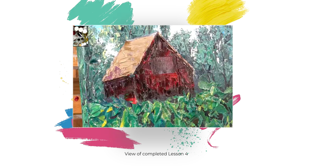
Lesson 4: Foreground Texture
#7 Let’s Dabble Art palette knife
Phthalo green
Burnt umber
Yellow ochre
Lemon yellow
Light blue
Neutral gray
Gloss gel
Sunflower Leaves
Since the greens are already mixed, now’s the perfect time to start mapping in the foreground sunflower leaves—even if the blossoms come later. There are two ways to do this, start with yellow, then work the green around it or start with green, and layer yellow on top later.
Using your #7 palette knife, mix phthalo green, burnt umber, yellow ochre, lemon yellow and gloss gel, scoop up and apply it in thick, chunky strokes to suggest large sunflower leaves. This is a texture-building stage, so go as thick as you'd like.
Scoop more paint as needed, and keep grabbing color from different spots in the mix to avoid applying the same green over and over.
Foreground
In the foreground areas, add a bit more lemon yellow to your mixture. This warms up the tone and helps distinguish the sunflower leaves from the cooler background greens. Let some of the darker colors show through underneath. Leaving bits of negative space gives the leaves depth and prevents the texture from looking too heavy.
Don’t forget the left and right sides of your canvas. Use the same mixture and strokes to carry the texture around the edges.
To create contrast between the foreground and background, revisit the background trees and cool them down. Mix a bit of light blue or neutral gray into your green pile, and lightly drag the mixture over the background tree shapes.
This subtle shift pushes the background back and helps your warm sunflower greens stand out.
If any color feels too intense, mix in a little neutral gray to soften it. No neutral gray on hand? Use a small amount of black or burnt sienna for a similar effect.Clean your palette knife.
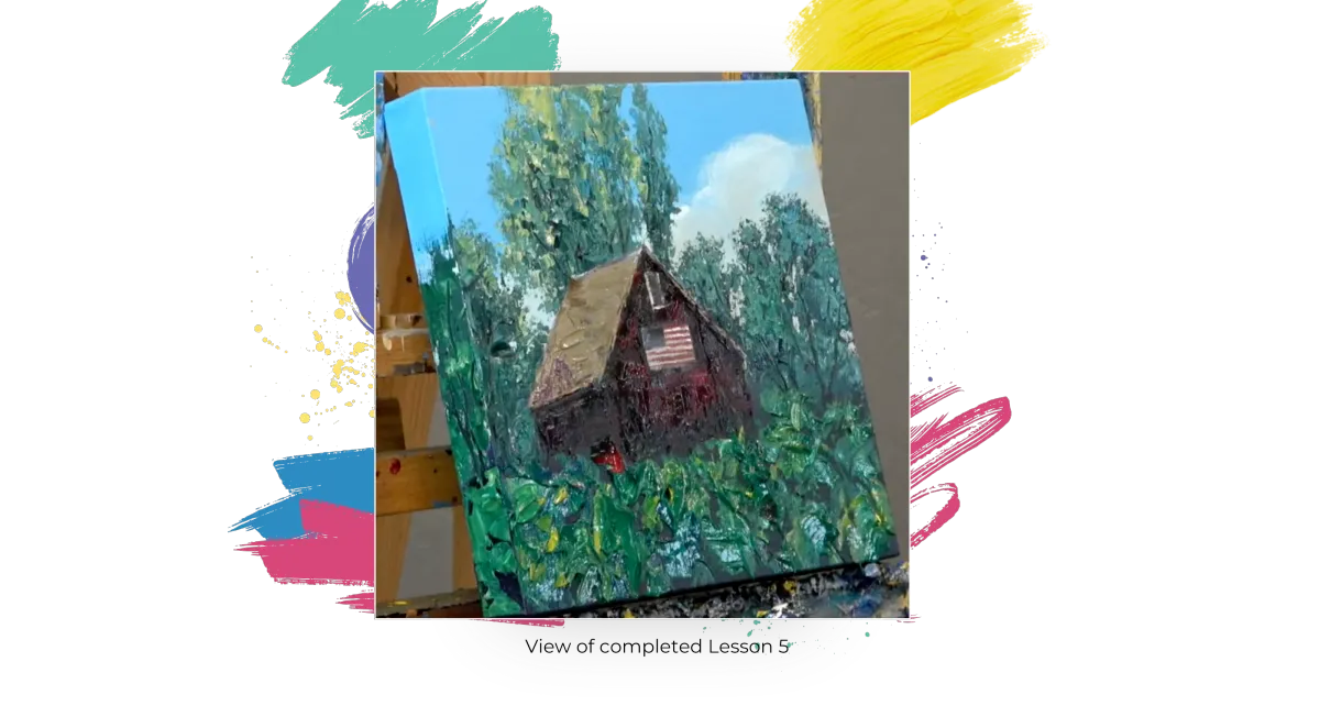
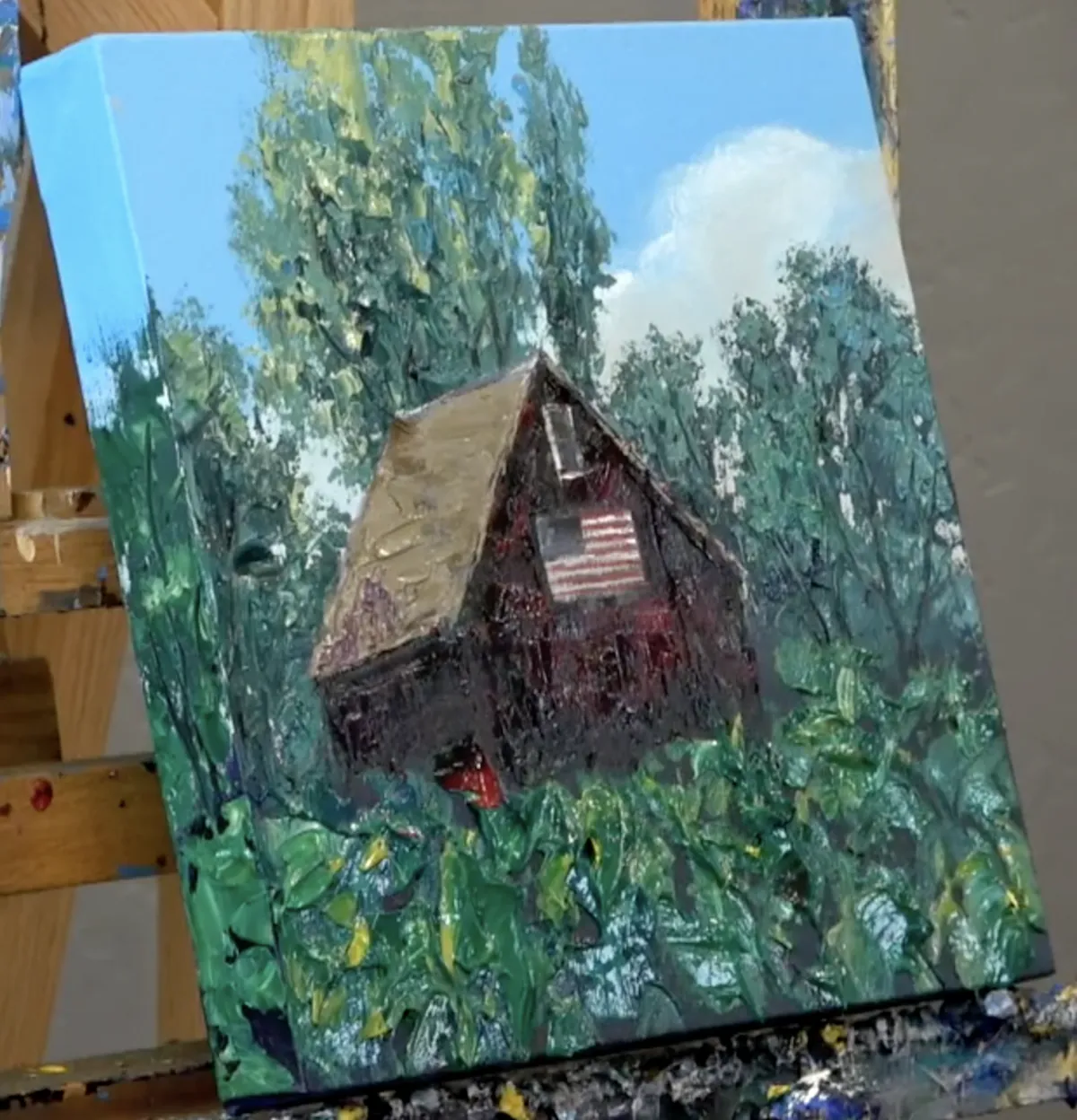
Lesson 5: Carving in the Trees
#1 Let’s Dabble Art brush and #7 Let’s Dabble Art palette knife
Ivory black
Green mixture
Tree Trunks and Branches
While the paint is still wet, grab your #1 round brush (or a #00 brush if you're working on a smaller canvas) and dip it into ivory black or burnt umber.
Use the tip of the brush to gently drag thin trunk and branch lines through the wet paint. This “carving” motion creates natural grooves in the texture and defines tree structure without overloading the painting with detail.
Twist your brush in the paint on your palette to form a fine point. As you drag the brush across the canvas, continue twisting lightly between your fingers—this creates natural, tapering lines that mimic the delicate shape of branches.
You don’t need to outline every detail. A few suggested lines will go a long way. Keep your branch placement light and intentional—avoid covering your leaves with too many lines.
If you go overboard or something doesn’t feel right, simply return to your original green leaf mixture and gently knife over any areas you'd like to soften. This painting method is extremely forgiving—just layer over and adjust as needed.
Straggler Leaves
Use the tip of your #7 palette knife to add in straggler leaves—those tiny, loose suggestions of leaves that appear on the outer edges of tree clusters. Tap lightly or scrape gently to place them just where needed. This breaks up large, dense sections and keeps everything feeling light and natural.
Clean your brush and palette knife.
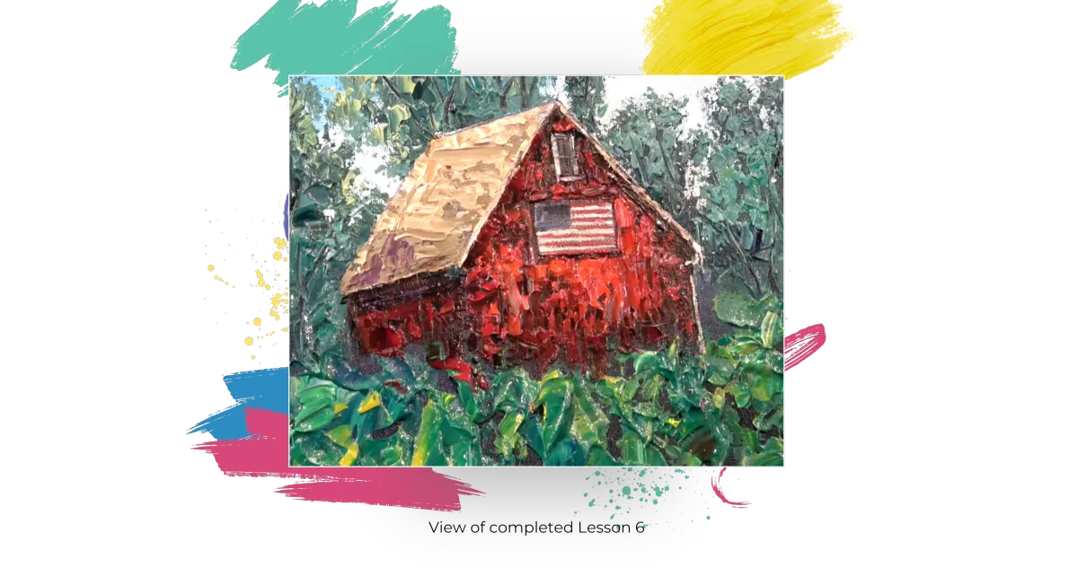
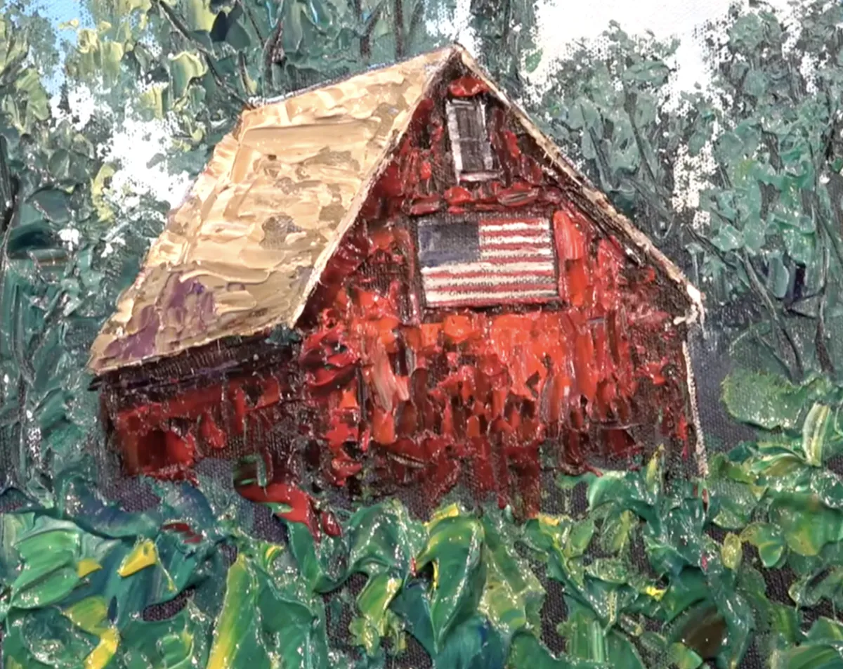
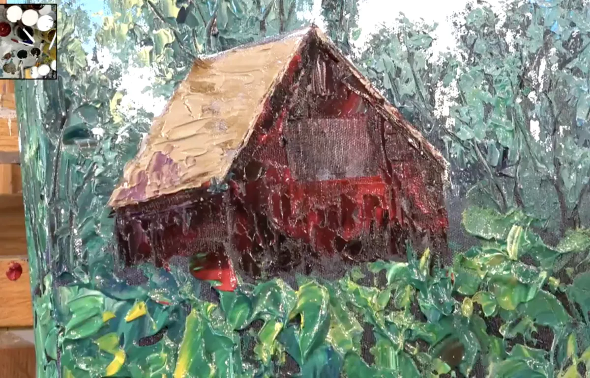
Lesson 6: The Barn
#7 Let’s Dabble Art palette knife and #12 Let’s Dabble Art brush
Crimson
Ivory black
Burnt umber
Burnt sienna
Titanium white
Brilliant purple
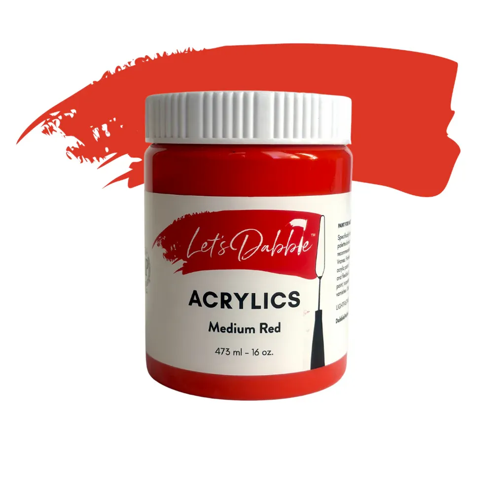
Medium red
Ultramarine blue
Gloss gel
Barn Base- First Layer
Grab your #7 palette knife, mix crimson, ivory black, burnt umber.and gloss gel. Apply this mixture in vertical strokes, mimicking the wood grain of old barn boards. Begin with the darkest tones first—this creates depth and structure. As you move toward the bottom and edges of the barn, darken the mix even more by adding a bit more ivory black or burnt umber.Leave space where the window and flag will go. Simply scrape that section clean with your knife to keep those areas smooth and paint-free for now.
Barn Roof
Mix burnt umber, burnt sienna, titanium white and gloss gel. Use the edge of your palette knife to guide the shape of the roof and block it in with thick, textured strokes. Hold the palette knife at an angle and let it act as a ruler to carve out clean edges.Keep this layer dark and moody—it’s just the first pass. Don’t worry if the texture isn’t perfect. You’ll refine it with highlights later.
Shadow
Mix brilliant purple, burnt sienna and gloss gel. Apply this shadow color using your knife or brush to the right side of the barn and below the roofline. Keep it soft and textured. Use the same mix to deepen the edge under the flag area as well.
The Flag
Grab your #12 brush, start by mixing a little neutral gray with titanium white and loosely sketch a rectangle where the flag will go. The edges don’t need to be perfect—keep it loose and painterly. Next, block in a small blue square in the upper left corner of the flag area. This will be the base for the stars section. For the red stripes, mix crimson, medium red, and ultramarine blue to deepen the tone. Then lightly tap your brush to apply alternating red and white strokes, keeping it casual and textured. Don’t worry about getting perfectly crisp lines—rough edges add character.
Go back in with a lightened white mix (using that same neutral gray and titanium white combo) to define the white stripes. Keep your hand steady by resting it gently on your easel if needed, and be sure to clean your brush between color shifts to keep the tones fresh.
If the edges of the flag feel too sharp, soften them by brushing a little barn red around the sides to blend it back in with the wall.
Barn Window
With a dark gray mix (ivory black and neutral gray), use the tip of your brush to paint a simple rectangular window under the roof. Block in the shape first, then refine it by adding thickness to the lines.
If the edges aren’t clean, use your #7 palette knife and the barn red mix to go back and sharpen up the frame by cutting into the edges.
Barn Second Layer
Switch to your #7 palette knife, mix crimson, medium red and gloss gel. Apply a second coat over the barn, leaving some of the darks from the first layer showing through. Let the palette knife skip across the surface—this helps keep texture and dimension. For the right side of the barn, darken the mix again with ivory black to create a strong shadow that flows down into the sunflower area.
Barn Roof Highlight
To lighten the roof, take your original dark roof mix and add more titanium white. Apply this highlight mix to the top sections of the roof. Let some of the darks show through for contrast. You can also edge the roof with this lighter tone, using the side of your palette knife for precision.
Optional: Rain Gutters
Dip a small brush into the light gray mix and lightly outline the edge of the roof. Add simple rain gutters if desired. You can also edge the flag with a touch of white to help it stand out. Try it—and if you don’t like the effect, simply paint over it.
This barn is meant to feel weathered and charming, not perfect. Embrace the quirks in the structure—barns are rarely symmetrical, and that’s part of their charm.
Clean your palette knife and brush.
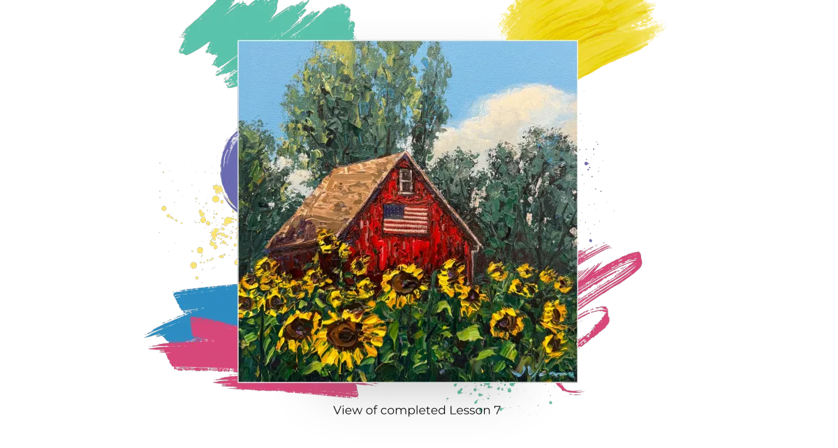
Lesson 7: The Sunflowers
#1 and #7 Let’s Dabble Art palette knives, #1 and #00 Let’s Dabble Art brushes
Burnt umber
Burnt sienna
Ivory black
Yellow ochre
Lemon yellow
Titanium white
Burnt sienna
Phthalo green
Light blue
Gloss gel
Sunflower Centers
Begin by mixing burnt umber, burnt sienna, ivory black with some gloss gel to create a rich, dark center color. Use your #1 round palette knife (the spoon-shaped one) and press the back of it into the canvas to create thick circular centers for each sunflower.
Start with larger circles in the foreground, and make them smaller as they move toward the back. Keep the layout loose and natural—don't crowd the canvas. Leave some open breathing space where no blooms are placed to break up the rhythm and make the composition feel more organic.
First Layer of Petals
Switch to your #7 palette knife, mix yellow ochre, lemon yellow, a bit of titanium white, burnt sienna (optional, for warmth) and gloss gel. Use the tip of the palette knife to lay in petal shapes around the sunflower centers. Press it into the surface, allowing the thick paint to skip across the existing texture. Petals should radiate outward but don’t make them all uniform—vary the angles and shapes to keep it lively.
Some petals can overlap the dark centers slightly. Others can trail off to the side. Keep it loose, especially for the background flowers, where just a hint or cluster of petals will do. You don’t need to define every single petal—suggestion is enough.
Pro Tip: After each stroke, wipe your palette knife clean to keep the yellow from picking up green or brown paint underneath. This keeps your yellows bright and fresh.
To enrich the centers, mix burnt sienna and yellow ochre. Add a ring of this tone around the existing dark centers for more depth. Then, if needed, return to your original burnt umber mix and even drop in a touch of brilliant purple for added richness and contrast.
These unexpected colors (like a bit of purple or white-violet) can bring life and variation to a traditionally brown-and-yellow flower.
Adding Stalks and Leaf
With your #1 brush, mix phthalo green and dark purple (red violet deep), this mixture should be darker than the leaf green to help the stalks stand out. Pull thin, vertical lines from the sunflower centers downward to suggest stems. If the stalk is partially hidden behind leaves, don’t worry—it still gives structure. Use the same mix with a small addition of lemon yellow and titanium white to create a lighter version for the highlighted edges of leaves.
Switch back to your #7 palette knife, and gently scrape this highlight color over the top of your previously painted leaves to catch where the light might hit. Carry some of this around the canvas edges as well.
Highlighting the Petals
Mix lemon yellow, titanium white and gloss gel. Use the tip of your palette knife to add small highlight strokes to a few sunflower petals—especially those facing the light. You don’t need to highlight every flower or every petal. Just a few sparkle spots can make the whole piece come alive.
Always wipe your knife clean between applications to keep the yellows bright and free from contamination.
If your sunflower petals feel too crowded or lose their definition, go back in with some green to break up the shapes. This helps separate individual flowers and adds contrast.
The sunflowers in the background can be painted more loosely and abstract, suggesting form without over-detailing. Use grouped petal strokes to hint at the flowers without defining each one.
Your Signature
To make it easier to paint your signature, spritz a tiny bit of water into the paint to make it more fluid if it needs it. Twist your clean #00 brush right through light blue mixed with titanium white or whatever color you want on your palette. Then carve your name right in the wet paint in the bottom right corner. I wipe my brush with a baby wipe after each letter and then reload the brush with paint.
Name your painting with a unique name. Congratulations, you are almost done. Now it’s time to sign the back. I use a thin black permanent marker.
I put © and my name.
Then I put up my website.
Next, I put the title in all caps and in quotes.
Last, I put my full signature.